Heuristic Evaluation Report
Bachelor's Project PCEE
Florian Zollner
Evaluation of the Web Application
Parallel Coordinates Explorable Explainer (PCEE)
Report of 17 Dec 2025
1 Executive Summary
The Parallel Coordinates Explorable Explainer (PCEE) is a web application, which provides an interactive tutorial about the parallel coordinates visualisation technique for multidimensional data. Four experts in data visualisation were recruited to review and evaluate the application, using the method of Heuristic Evaluation. The evaluations were performed in Sep and Oct 2025. Notes were taken by the facilitator and each evaluation session was recorded. Afterwards, the notes and recordings were analysed and assembled into three lists of findings: positives, negatives (problems), and bugs. Similar findings mentioned by multiple evaluators were merged into one. The problems were then assigned severity ratings and ordered by mean severity.
The first part of the report focuses on the positive aspects of the web application. These findings were ordered by number of occurrence. The most found positive findings were that the moving of the dimensions works without any issues and that the interactive part of the web application called “Case Study” is a great teaching tool.
Negative findings are ranked in descending order of mean severity, so the most serious problems are listed first. The severity ratings were assigned individually by three members of the project team and then averaged. The most severely rated negative finding was that the transition between different charts is very sudden and can distract the user. Furthermore, in the top left corner of each chart, an arrow icon (for a collapsible toolbar) can be found, which allows the user to access various functions. This collapsible toolbar was hard to find, because it is not recognised as important. Another issue was that the values of a polyline in a chart are not displayed when hovering over a polyline.
Numerous bugs discovered during the evaluation are also listed. Bugs are behaviour unintended by the developers of the system. For example, the filter icon on a graph's axis moved too far upwards and overlapped with another UI element. Another bug was found which made it impossible to filter out the uppermost polyline. During the first expert evaluation, a particularly glaring bug (Bug 7) was discovered, when adding new columns of data to the Personal Finances data table. This bug was immediately fixed for the following three evaluations.
2 Introduction
The Parallel Coordinates Explorable Explainer (PCEE) is an interactive tutorial about the parallel coordinates visualisation technique for multidimensional datasets. It is designed for newcomers to the topic to learn the basics about parallel coordinates and become familiar with this kind of graphical chart. PCEE is an open-source project; the source code is available at [And2025a]. A live version of the tool is hosted at [And2025b].
3 Evaluation Procedure
This section describes the procedure used in the heuristic evaluation.
3.1 Evaluation Methodology
The heuristic evaluation (HE) method is used to evaluate a user interface (UI) with a set of common guiding principles, known as the heuristics. The method was first described by Jakob Nielsen and Rolf Molich in 1990 [Nie1990]. A small number (typically three or four) of specialised evaluators look through the UI and use their judgement and experience to assess where potential issues may arise. A small set of typically ten to fifteen heuristics is provided to suggest what to look out for. For this project, the Andrews General Usability Heuristics (see Section A.1) were used. They are adapted from the updated set of 10 usability heuristics published by Nielsen in 1993 [Nie1993]. The descriptions of the heuristics were revised with new examples in 2024 [Nie2024]. Redacción Aguayo describes some strategies and best practices for heuristic evaluation [Agu2025]. For further reading, Chauncey Wilson provides a good description of heuristic evaluation [Wil2013, Chapter 1].
An important aspect of a HE is that the evaluation is done by each evaluator separately, working alone. Sometimes, each evaluator makes their own notes and takes screenshots and/or video clips to illustrate their findings as they go along. For this project, since the evaluators' time was precious, notes were taken by the facilitator, and screenshots and/or video clips were created or extracted by the facilitator afterwards from each session recording. When formulating findings, the facilitator took into account both verbal comments and non-verbal gestures or expressions indicating a particular reaction or emotion.
After the four individual evaluations, the findings were aggregated into a long list using a spreadsheet. Positives findings, negative findings, and bugs were compiled into separate lists. Where multiple evaluators found similar issues, these were merged into one. The aggregated list of negative findings (problems) was then distributed to three project team members, who assigned a severity rating to each problem. Finally, the problems were sorted in decreasing order of mean severity, so the most serious problems are at the top of the list.
3.2 User Profiles
Two user profiles were identified for PCEE:
-
Students in an InfoVis class: PCEE can be used to support lecture material in an Information Visualisation course. The lecturer might demonstrate the concept of parallel coordinates in class and students can revisit and work through the tutorial at home.
-
Independent Study: PCEE can be accessed online, so can enable a broad variety of people to learn about the topic of parallel coordinates without the need to attend a course.
3.3 Extent of the Evaluation
The evaluation covered the entire PCEE tool. The branch “Test-2025-09-24” was used by the first evaluator Michael, who encountered a serious bug (Bug 7). The bug was hot-fixed and a new branch “Test-2025-09-30” was used by the other three evaluators.
3.4 Evaluators and Evaluation Environments
Four expert evaluators were recruited. To protect the privacy of the evaluators, they are referred to by a first name alias, and all video clips in this report have been pixelated. The evaluators and the evaluation environments used are shown in Table 1.
| Evaluator | Michael (MI) | Nathan (NA) | Otto (OT) | Peter (PT) |
|---|---|---|---|---|
| Age Range | 40-49 | 50-59 | 40-49 | 40-49 |
| Gender | male | male | male | male |
| Profession | Senior Researcher | Professor | Professor | Professor |
| Research Field(s) | AI and Visualisation | Visualisation | HCI and Visualisation | Visualisation |
| Years of Experience | 25 | 25 | 25 | 25 |
| Device | HP Elitebook 840 G10 | HP Elitebook 840 G10 | HP Elitebook 840 G10 | HP Elitebook 840 G10 |
| OS and Version | Debian 13 | Debian 13 | Debian 13 | Debian 13 |
| Screen Size | 27″ | 27″ | 27″ | 27″ |
| Screen Resolution | 3840×2160 | 3840×2160 | 3840×2160 | 3840×2160 |
| Web Browser | Chromium 141.0.7390.107 | Chromium 141.0.7390.107 | Chromium 141.0.7390.107 | Chromium 141.0.7390.107 |
| Internet Connection | none | none | none | none |
| Screen Recording Software | OBS Studio 32.0.1 | OBS Studio 32.0.1 | OBS Studio 32.0.1 | OBS Studio 32.0.1 |
| Recording Resolution | 1920×1080 | 1920×1080 | 1920×1080 | 1920×1080 |
| Date of Evaluation | 2025-09-24 | 2025-09-30 | 2025-09-30 | 2025-10-04 |
| Time of Evaluation | 14:00-15:00 | 10:00-11:00 | 12:00-12:30 | 13:13-14:30 |
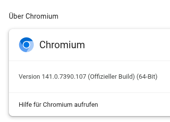
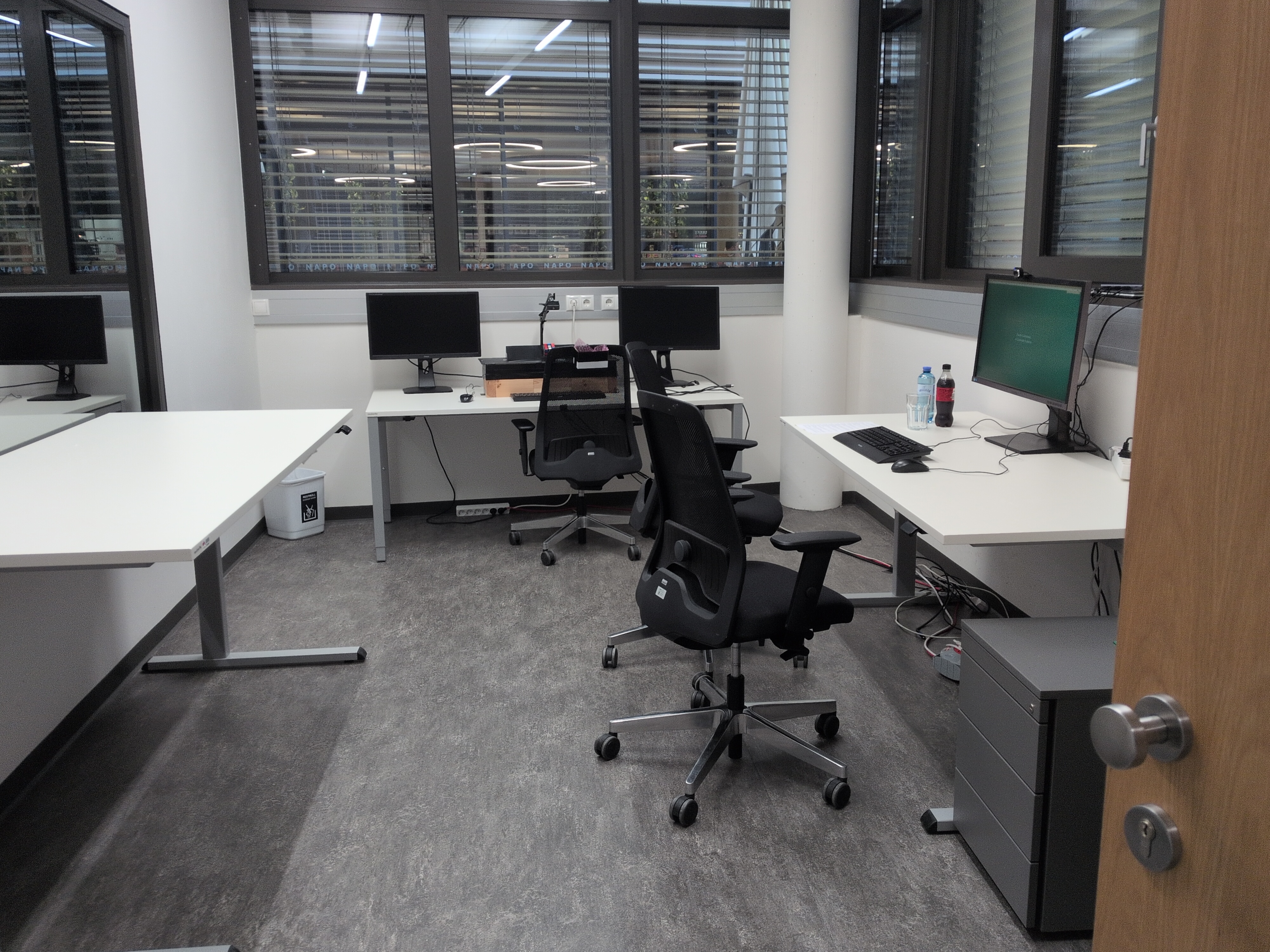
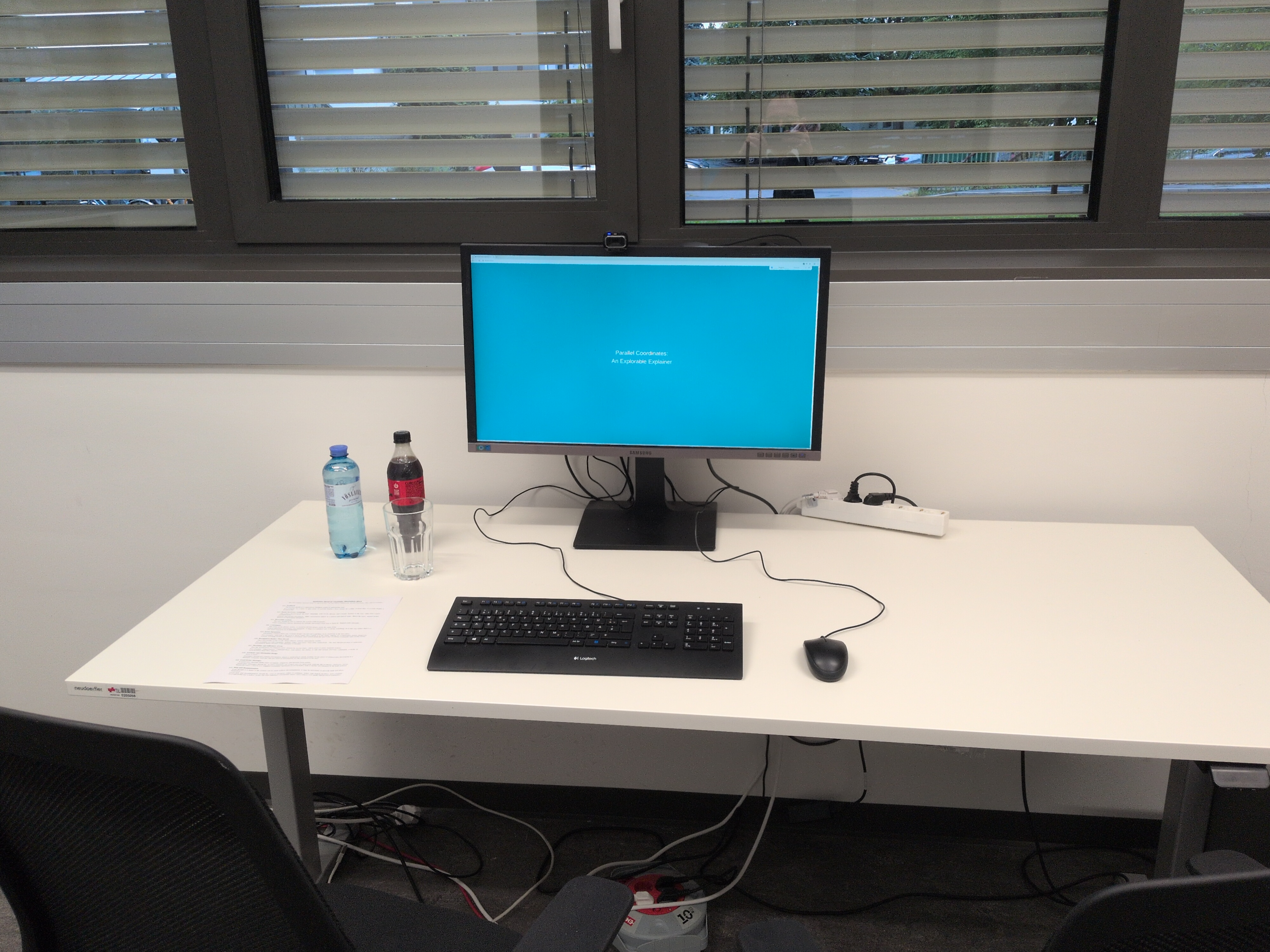
All evaluators used the same hardware setup: a PC running Debian 13, Samsung 4k external monitor, Microsoft LifeCam HD-3000 webcam, and external keyboard and mouse. Chromium for Linux version 141.0.7390.107 was used as the web browser, as can be seen in Figure 1. The screen was recorded at a resolution of 1920×1080 and the webcam at 640×480 using OBS Studio 32.0.1. All evaluations were carried out in the same test room, shown in Figures 2a and 2b.
Audacity 3.7.3 was used for audio processing. Kdenlive 24.12.3 was used for video editing and transcoding. All videos were transcoded to 1920×1080 at 30 FPS.
3.5 Data Collection
Before starting the evaluation, the evaluators were given a short introduction. Then, they were given a consent form to read and sign, which can be found in Section A.4 Consent Form. Any questions regarding data collection were answered before the start of the recording.
4 Results of the Evaluation
The findings were organised into three groups: positives, negatives (problems), and bugs. Each finding is associated with the evaluator(s) who found it. The name codes assigned to each evaluator are shown in Table 2.
| Code | Evaluator |
|---|---|
| MI | Michael |
| NA | Nathan |
| OT | Otto |
| PT | Peter |
| y | Found by this evaluator |
4.1 Top Two Positive Findings
The top two positive findings, according to their number of appearances, are described in more detail below. If two or more findings have the same number of occurrences, they are seen as equivalent.
P01. Moving Dimensions Working
| Title: | Moving Dimensions Working |
|---|---|
| Description: | Moving (reordering) dimensions is a key feature for the visualisation of parallel coordinates. It is a necessary tool to find correlations and compare the different dimensions of the data. Moving dimensions in any chart worked without a problem. The dimensions can be moved in any direction. |
| Video Clip(s): | p01-mi-pos01-moving-dimensions.mp4 |
| Location (How Reproducible?): | Scroll down to any chart → Click and hold the name of dimension → Drag it to the left or right |
In Figure 3, one can see one of the most used actions: moving dimensions. It is an essential action for visual analysis of a multidimensional dataset.
P02. Case Study has Great Interactivity
| Title: | Case Study has Great Interactivity |
|---|---|
| Description: | The case study lets the user step through different actions on parallel coordinates. It is an interactive explanation of possible steps that can be taken to analyse the data. Furthermore, it is a great tool for teaching, since the user can follow along as the steps are performed. |
| Video Clip(s): | p02-mi-pos03-case-study.mp4 |
| Location (How Reproducible?): | Scroll down near the end to “Case Study” |
Figure 4 shows one of the tutorial sections: the “Case Study”. The “Case Study” was praised for the good visualisation of the different steps taken.
4.2 List of All Positive Findings
Table 3 shows a list of all the positive findings which emerged from the evaluation, sorted in decreasing order of occurrence, i.e., the most found are at the top of the table.
| No. | Title | Description | Video Clip(s) | Location (How Reproducible?) | Found By | |||
|---|---|---|---|---|---|---|---|---|
| MI | NA | OT | PT | |||||
| 1 | Moving Dimensions Working | Moving (reordering) dimensions is a key feature for the visualisation of parallel coordinates. It is a necessary tool to find correlations and compare the different dimensions of the data. Moving dimensions in any chart works without a problem. The dimensions can be moved in any order. | p01-mi-pos01-moving-dimensions.mp4 | Scroll down to any chart → Click and Hold the name of dimension → Drag it to the left or right | y | y | ||
| 2 | Case Study has Great Interactivity | The “Case Study” lets the user step through different actions on parallel coordinates. It is an interactive explanation of possible steps that can be taken to analyse the data. Furthermore, it is a great tool for teaching, since the user can follow along as the steps are performed. | p02-mi-pos03-case-study.mp4 | Scroll down near the end to “Case Study” | y | y | ||
| 3 | Show Outlier Great for Learning | Showcasing the finding of an outlier is a great interactive learning tool. | p03-mi-pos02-outlier.mp4 | Scroll down to “Usage” → Click on the “Show Outlier” Button → Look at the chart on the left → Click on “Show Outlier” Button | y | |||
| 4 | Table is Inviting to Interact | The table on the right-hand side for the “Personal Finance Dataset” invites the user to interact. It is clearly displayed that the data can be displayed in the chart. | p04-na-pos01-table.mp4 | Scroll Down to the first table | y | |||
| 5 | Page Layout Easy to Navigate | The page layout is a combination of information and examples. The data is updated as the user goes through the application. | p05-na-pos02-layout.mp4 | General Statement | y | |||
| 6 | Great for Individual Learning | The application allows for individual learning. If something is not understood, the user can always go back. | p06-na-pos03-learning.mp4 | General Statement | y | |||
| 7 | Reversibility Achieved | The reversibility of the application is given. All actions are reversible for the user. | p07-na-pos04-reversibility.mp4 | General Statement | y | |||
| 8 | Minimalist Design Achieved | Minimalist design is achieved. Aiding that is a good font setting. | p08-na-pos05-minimalist.mp4 | General Statement. | y | |||
| 9 | Context Menu | Context menus can be great for many users. | p09-ot-pos01-context-menu.mp4 | General Statement | y | |||
| 10 | Dimension's Range Adjusting Useful | Adjusting the dimension's range is not commonly implemented. It is a very useful feature. | p10-ot-pos02-range.mp4 | Scroll down to “Operations on Dimensions” | y | |||
| 11 | Useful for Education | In education, this application can be used as an additional resource. The interactivity helps the learning process. | p11-pt-pos02-education.mp4 | General Statement | y | |||
| 12 | Easy Chart Reset | Any chart can be easily reset. This allows the user to always return to the initial state. | p12-pt-pos03-reset.mp4 | Scroll down to any chart → Click the double-arrow collapsible toolbar → Click the most right icon from this list | y | |||
4.3 Top Five Problems
The top five problems according to their mean severity are described in more detail below. Severity ratings between 0 (lowest) and 4 (highest) were assigned after the evaluation by three members of the project team, using the rating scheme shown in Table 4. The first problem (N01) is the problem (negative finding) with the highest mean severity.
| Severity | Meaning |
|---|---|
| 4 | Catastrophic problem |
| 3 | Serious problem |
| 2 | Minor problem |
| 1 | Cosmetic problem |
| 0 | Not a problem |
N01. Chart Transition Unexpected
| Title: | Chart Transition Unexpected |
|---|---|
| Description: | The transitions between the charts can be distracting and confusing. Most web applications use a smoother effect, so as to not distract the user. |
| Video Clip(s) | n01-mi-neg09-transition.mp4 |
| Heuristic: | A02 Speak the Users' Language |
| Only When: | |
| Location (How Reproducible?): | Scroll down until a jump between charts occurs |
| Mean Severity: | 4.0 |
Figure 5 shows the transition between the charts is nearly instantaneous, which can distract the user. To mitigate this behaviour, a fading effect could be added as a transition between charts.
N02. Arrow Toolbar Hard to Find
| Title: | Arrow Toolbar Hard to Find |
|---|---|
| Description: | When seeing a chart, there is always a collapsible toolbar button in the top left-hand corner of the chart with two arrows on the top left side. Such a collapsible toolbar is not a standard in such applications and can be hard to find. On first glance it is unclear what this toolbar is used for. |
| Video Clip(s): | n02-ot-neg18-menu.mp4 |
| Heuristic: | A02 Speak the Users' Language |
| Only When: | |
| Location (How Reproducible?): | Scroll to any chart → click on the button with two arrows on the left-hand side |
| Mean Severity: | 3.67 |
Figure 6 shows that the arrow collapsible toolbar does not follow best practices. This issue could be solved by implementing the toolbar in a recognized way like in a hamburger menu.
N03. Data Values not Shown
| Title: | Data Values not Shown |
|---|---|
| Description: | When hovering/selecting a line in the chart, the user expects to see the corresponding values. |
| Video Clip(s): | n03-mi-neg06-line-values.mp4 |
| Heuristic: | A06 Recognition Rather Than Recall |
| Only When: | |
| Location (How Reproducible?): | Scroll to any chart → Hover over/select a line |
| Mean Severity: | 3.67 |
Two of the four evaluators found that values can only be estimated when hovering over a line. This is shown in Figure 7. This can be solved by showing the values of the current line either directly above the line or below the chart.
N04. Unfinished Explanation of Line Selection
| Title: | Unfinished Explanation of Line Selection |
|---|---|
| Description: | The text does not explain to the user how to select multiple lines. The text fails to tell this key functionality. |
| Video Clip(s): | n04-mi-neg07-multiple-lines.mp4 |
| Heuristic: | A10 Help and Documentation |
| Only When: | |
| Location (How Reproducible?): | |
| Mean Severity: | 3.67 |
In Figure 8 it is showcased, that the user is not shown on how to select multiple lines. This problem can be resolved by adding an explanation.
N05. Current Position in Application Unknown
| Title: | Current Position in Application Unknown |
|---|---|
| Description: | There is no overview of the whole application. The user does not know where they currently are and what they are going to do with this application. The only way to know where the user is in the application is the scroll bar. A standard for modern (web) applications is the displaying of the current position in some way. |
| Video Clip(s): | n05-na-neg10-position.mp4 |
| Heuristic: | A10 Help and Documentationy |
| Only When: | |
| Location (How Reproducible?): | |
| Mean Severity: | 3.33 |
The user expected to know the current position of the displayed content relative to page. This is not done here, as can be seen in Figure 9. To overcome this issue, a navigation bar on top could be added.
4.4 List of All Problems Found
Table 5 shows a list of all the problems found (negative findings) in the evaluation, sorted in decreasing order of mean severity. The name codes assigned to each expert evaluator are shown in Table 2. The name codes assigned to the team members who assigned severity ratings are shown in Table 6.
| No. | Title | Description | Video Clip(s) | Heuristic | Only When | Location (How Reproducible?) | Found By | Severity Rating | ||||||
|---|---|---|---|---|---|---|---|---|---|---|---|---|---|---|
| MI | NA | OT | PT | KA | RG | FZ | Mean | |||||||
| 1 | Chart Transition Unexpected | The transitions between the charts can be distracting and confusing. Most web applications use a smoother effect, so as to not distract the user. | n01-mi-neg09-transition.mp4 | A02 Speak the Users' Language | Scroll down until a jump between charts occurs | y | y | y | 4 | 4 | 4 | 4.00 | ||
| 2 | Arrow Toolbar Hard to Find | When seeing a chart, there is always a collapsible toolbar button in the the top left-hand corner of the chart with two arrows on the top left side. Such a collapsible toolbar is not a standard in such applications and can be hard to find. On first glance it is unclear what this toolbar is used for. | n02-ot-neg18-menu.mp4 | A02 Speak the Users' Language | Scroll to any chart → click on the button with two arrows on the left-hand side | y | y | y | 4 | 3 | 4 | 3.67 | ||
| 3 | Data Values not Shown | When hovering/selecting a line in the chart, the user expects to see the corresponding values. | n03-mi-neg06-line-values.mp4 | A06 Recognition Rather Than Recall | Scroll to any chart → Hover over/select a line | y | y | 4 | 3 | 4 | 3.67 | |||
| 4 | Unfinished Explanation of Line Selection | The text does not explain to the user how to select multiple lines. The text fails to tell this key functionality. | n04-mi-neg07-multiple-lines.mp4 | A10 Help and Documentation | y | y | 4 | 3 | 4 | 3.67 | ||||
| 5 | Current Position in Application Unknown | There is no overview of the whole application. The user does not know where they currently are and what they are going to do with this application. The only way to know where the user is in the application is the scroll bar. A standard for modern (web) applications is the displaying of the current position in some way. | n05-na-neg10-position.mp4 | A10 Help and Documentation | y | y | y | 3 | 4 | 3 | 3.33 | |||
| 6 | Inputting Characters into Table not Possible | The input of characters into the table is not possible. If the user wants to input something other than a number, it does not work. No feedback is given. | n06-pt-neg01-characters.mp4 | A01 Feedback | Scroll down to the first table on the right → try to change a number to a character | y | 2 | 4 | 4 | 3.33 | ||||
| 7 | State of Chart not Shown | The user can be confused by the current state of the chart. The application should put important information in front of the user. | n07-ot-neg09-state.mp4 | A10 Help and Documentation | Scroll to any chart | y | 3 | 2 | 4 | 3.00 | ||||
| 8 | Cluster Interaction Lacks Interactivity | The application provides interactive operations for most of the explained topics. Such an operation is missing for clusters. | n08-mi-neg13-cluster-interaction.mp4 | A04 Consistency | Scroll down to “Usage” | y | y | 3 | 3 | 2 | 2.67 | |||
| 9 | Chart Line is Hard to Catch | Polyline selection in the chart is an important tool. The line can only be selected when directly clicking on it. It would have been expected to have more area around a line that can be used to select a line. | n09-ot-neg01-keywords.mp4 | A07 Flexibility and Efficiency of User | Go to any chart → select a line | y | 2 | 2 | 4 | 2.67 | ||||
| 10 | Embed Chart Symbols in Text | How to use the chart is explained in written Form. The symbols used in the chart are not show in the written explanation. Symbols could be placed into the text to recognize them faster. | n10-ot-neg07-embed.mp4 | A10 Help and Documentation | Scroll to “Operations on Dimensions” | y | 3 | 1 | 4 | 2.67 | ||||
| 11 | Adding Data from Table to Chart Confusing | In the ”Personal Finance Dataset” table, the data form the table cannot be added to the chart if not all fields are filled out. | n11-mi-neg02-add-data.mp4 | A05 Error Prevention | not all fields in the table are filled out | Scroll until the table on the right-hand side is displayed → Click on the “+” in the top right corner of the table → add a heading and two rows of data to the new column | y | 2 | 2 | 3 | 2.33 | |||
| 12 | Case Study Explanation Missing | The “Case Study” has no explanation beforehand, and the user needs to figure out what actions are required by the application. | n12-mi-neg16-case-study-explanation.mp4 | A10 Help and Documentation | Scroll down to “Case Study” | y | 3 | 1 | 3 | 2.33 | ||||
| 13 | Setting Range of Dimension not Intuitive | On any chart setting the range for a dimension is not intuitive. It is hard to distinguish setting the range and filtering on the icon only. | n13-pt-neg02-range.mp4 | A02 Speak the Users' Language | y | 1 | 2 | 4 | 2.33 | |||||
| 14 | Chart Filter not Reset Correctly | The filter seems to be off, but it is still filtering. This behaviour can cause confusion. | n14-pt-neg10-filter.mp4 | A05 Error Prevention | Scroll down to first graph → Move a filtering slider down → move it back up while dragging the mouse horizontally | y | 2 | 1 | 4 | 2.33 | ||||
| 15 | Minimal Guidance for User | In modern teaching applications, the user is specifically taken through and helped by the application. In this application, the user can freely choose what they do next. | n15-ot-neg05-animations.mp4 | A02 Speak the Users' Language | y | y | y | 2 | 2 | 2 | 2.00 | |||
| 16 | Interact Directly Button Poorly Integrated | The application wants to explain to the user how the system works before giving full control. With the “Interact Directly” button, this does not hold up anymore. | n16-mi-neg18-interact-directly.mp4 | A04 Consistency | Scroll down to “Case Study” | y | y | 4 | 2 | 0 | 2.00 | |||
| 17 | Chart Refresh not Explained | There is no clear explanation for what refresh can be used for in this web application. | n17-mi-neg10-refresh.mp4 | A02 Speak the Users' Language | Scroll to any chart → click on the button with two arrows on the left-hand side | y | 1 | 1 | 4 | 2.00 | ||||
| 18 | Reset Interactivity on Movement | When interacting with the “Case Study” and the “Interact Directly” Button is pressed and the user moves to another part of the application and back, it is set to the initial state. | n18-mi-neg21-reset-selection.mp4 | A01 Feedback | scroll Down to “Case Study” → Click “Interact Directly” → scroll back to the top of the page → Scroll Down to “Case Study” | y | 3 | 0 | 3 | 2.00 | ||||
| 19 | Reset Table and Redraw Chart Unintuitive | In “Personal Finance Dataset“ table, the “Reset Table” button beneath the chart should only be used to reset the table and not redraw the chart. The “Redraw Chart” button should be to redraw the chart. | n19-ot-neg03-redraw.mp4 | A04 Consistency | Scroll down to the table → click on the “Reset Table” button | y | 1 | 3 | 2 | 2.00 | ||||
| 20 | Interaction Parts Presented Late | The interactions in the system partially appear after the explanation. This breaks the thinking process of the user. | n20-ot-neg06-interaction.mp4 | y | 2 | 2 | 2 | 2.00 | ||||||
| 21 | Context Window Behaviour not Clear | The user expected that the context window could be opened at any position on a dimension. The explanation should make clear when and where the context menu can be opened. | n21-ot-neg08-context-window.mp4 | A10 Help and Documentation | y | 2 | 0 | 4 | 2.00 | |||||
| 22 | Separate Introduction and Interactivity | In the “Case Study” it can be confusing to have an explanation text mixed with interactive actions. In the application, the explanation is mostly separate from the Interaction. | n22-ot-neg14-interactivity.mp4 | A04 Consistency | Scroll Down to “Case Study” | y | 3 | 1 | 2 | 2.00 | ||||
| 23 | Range on First Chart Confusing | The range setting on the “Personal Finance Dataset” chart it is not described why the maximum has to be bigger than the actual maximum. | n23-pt-neg09-range.mp4 | A10 Help and Documentation | Scroll down to first graph → Right-click on “Leftover” → click on “Set Range” → enter 2000 as Minimum → click “Save” | y | y | 2 | 1 | 3 | 2.00 | |||
| 24 | Tooltips on Actions Missing | The charts in the web application have no indications for dragging, filtering, and inverting. Tooltips are often used in modern applications. | n24-ot-neg02-tooltips.mp4 | A06 Recognition Rather Than Recall | Scroll down until the first chart is displayed → Hover over an arrow/triangle shape/label | y | y | y | 1 | 1 | 3 | 1.67 | ||
| 25 | Missing Test or Quiz at End | Many similar learning applications test the knowledge of the user after teaching them. PCEE only has free interaction, with no test or quiz at the end. | n25-mi-neg19-test-user.mp4 | A04 Consistency | y | y | y | 2 | 2 | 1 | 1.67 | |||
| 26 | Dataset Purpose Unclear | The user is not told what the purpose of the different datasets is. | n26-mi-neg12-dataset-purpose.mp4 | A10 Help and Documentation | y | 1 | 2 | 2 | 1.67 | |||||
| 27 | Interactive Correlation Missing | Correlations are not shown interactively like outliers. There is an interactive button for outliers but not for correlations. | n27-mi-neg14-interactive-correlation.mp4 | A04 Consistency | Scroll down to “Usage” → Looking for Correlations Between Dimensions | y | 2 | 0 | 3 | 1.67 | ||||
| 28 | Icons Look Handmade | The icons used in the double-arrow collapsible toolbar on the top left-hand side of every chart deviate from recognised standards. A standard icon library is used in other web applications to solve this problem. | n28-ot-neg17-icons.mp4 | A04 Consistency | Scroll to any chart → click on the button with two arrows on the left-hand side | y | 1 | 1 | 3 | 1.67 | ||||
| 29 | Remove Records from Chart Impossible | It is not possible to easily remove records from a chart. This action is only possible in the first chart. | n29-pt-neg03-removing.mp4 | A07 Flexibility and Efficiency of User | y | 2 | 0 | 3 | 1.67 | |||||
| 30 | Coordinated Multiple Views not Integrated Correctly | The screenshot in the section “Coordinated Multiple Views” does not fit in with the rest of the application. | n30-ot-neg13-coordinated-multiple-views.mp4 | A04 Consistency | Scroll Down to Coordinated Multiple Views | y | y | 2 | 1 | 1 | 1.33 | |||
| 31 | Buttons Have no Descriptions | The buttons for adding and deleting of rows and columns of the “Personal Finance Dataset” table have no description or context menu for further explaining their usage. | n31-mi-neg01-table-buttons.mp4 | A02 Speak the Users' Language | Scroll until the table on the right-hand side is displayed | y | 3 | 1 | 0 | 1.33 | ||||
| 32 | Case Study Highlight can be Misinterpreted | The blue highlight in the “Case Study” can be misinterpreted as clickable, because this design is often used in mobile applications. | n32-mi-neg15-case-study-clicking.mp4 | A02 Speak the users language | Scroll down to “Case Study” | y | 3 | 1 | 0 | 1.33 | ||||
| 33 | Interactive Operations Split During Explanation | The interactive operations are split into two separate groups. The verbal explanation is at the start of the application and the interactive “Case Study” is at the end. | n33-mi-neg17-operations-split.mp4 | Scroll down to “Case Study” | y | |||||||||
| 34 | Hiding Unselected Records | It is possible to select multiple lines in the chart. There is no option to use this functionality to remove not needed data points. | n34-na-neg04-scatter-plot.mp4 | A07 Flexibility and Efficiency of User | y | 1 | 0 | 3 | 1.33 | |||||
| 35 | Chart Data Table Hidden | To analyse the data in detail, the table containing the chart data can be very helpful. The table is, however, hidden in the two-arrow collapsible toolbar on the top left-hand side of a chart. It is not intuitive to find it in there. | n35-na-neg07-table.mp4 | A07 Flexibility and Efficiency of User | Scroll to any chart → click on the button with two arrows on the left-hand side | y | 2 | 2 | 0 | 1.33 | ||||
| 36 | Table Actions not Reversible | It is not possible for the user to undo or redo a single action in the “Personal Finance” table. The user can only get back to the initial state. | n36-ot-neg11-undo.mp4 | A03 Reversible Actions | Scroll to “Personal Finance” table | y | 2 | 0 | 2 | 1.33 | ||||
| 37 | Problems with Dimensions not Highlighted | It is not explained that this visualisation technique gets worse as the number of dimensions increases. | n37-pt-neg04-problems.mp4 | y | 1 | 2 | 1 | 1.33 | ||||||
| 38 | Inconsistent Explanations | The dataset explanation is done differently in the “Personal Finance Dataset” and the “Heart Health Dataset”. | n38-mi-neg08-explanation-inconsistent.mp4 | A04 Consistency | Scroll to “Personal Finance Dataset” → read explanation → Scroll to “Heart Health Dataset” → read explanation | y | 1 | 1 | 1 | 1.00 | ||||
| 39 | Out of Range Data Points Disappear | Out-of-range datapoints have to be remembered by the user. To make it visible to the user that a specific range is set, unused data points could be collected beneath the chart. | n39-ot-neg10-range.mp4 | A10 Help and Documentation | Scroll to any chart | y | 1 | 1 | 1 | 1.00 | ||||
| 40 | Simple Colours Used | Different shades of the same colour are used. An existing colour palette could be used for more familiarity. | n40-ot-neg16-colors.mp4 | A04 Consistency | Scroll Down to “Looking for Correlations between Dimensions” | y | 2 | 1 | 0 | 1.00 | ||||
| 41 | Quick Range Change Missing | There is no way to quickly change the range of a single dimension on any chart. It can take a long time to get into the settings if it needs to be done many times. | n41-pt-neg05-quick-setting.mp4 | A07 Flexibility and Efficiency of Use | Scroll down to the second chart → Right-click on the name of a dimension → click “Set Range” | y | 1 | 1 | 1 | 1.00 | ||||
| 42 | Polyline Selection by Dimension Value not Possible | It is not possible to select one or multiple polylines by clicking on a specific value on a dimension in any chart. | n42-pt-neg06-selection.mp4 | A07 Flexibility and Efficiency of Use | y | 2 | 0 | 1 | 1.00 | |||||
| 43 | Draggable Indicator Missing in Chart | A dimension in the chart can only be moved when it is dragged by its label. This can be hard to remember. | n43-na-neg01-draggable.mp4 | A06 Recognition Rather Than Recall | Scroll down to any chart → Click and Hold the label of a dimension → Move left/right | y | y | 1 | 0 | 1 | 0.67 | |||
| 44 | Outlier Explanation Unfinished | In the application, there is no clear definition of an outlier. It is only showcased what an outlier is. | n44-na-neg03-outlier.mp4 | A04 Consistency | y | 1 | 0 | 1 | 0.67 | |||||
| 45 | Add Selected Data to Separate Table | The functionality to select lines in the chart is given. For precise data reading, it would help to add only selected data to a (separate) table. | n45-na-neg09-advanced-table.mp4 | A07 Flexibility and Efficiency of Use | y | 1 | 1 | 0 | 0.67 | |||||
| 46 | Button Names Missing Without Cause | Icon buttons are used for predefined clear actions that are often used. In the double-arrow collapsible toolbar, the buttons are not visible all the time. | n46-ot-neg19-buttons.mp4 | A02 Speak the Users' Language | Scroll to any chart → click on the button with two arrows on the left-hand side | y | 1 | 0 | 1 | 0.67 | ||||
| 47 | Scatter Plot Images without Interaction | In the Usage section, scatter plot images are shown for theoretical explanation. No interactions on the scatter plot show the connections to the PC chart. Most of the other discussed features have an interaction and a theoretical part. | n47-na-neg06-hiding.mp4 | A07 Flexibility and Efficiency of Use | y | 1 | 0 | 0 | 0.33 | |||||
| 48 | Useless Tooltip | The tooltip in the chart shows the name of a dimension when hovering over the dimensions' label. | n48-mi-neg03-useless-tooltip.mp4 | A08 Aesthetic and Minimal Design | Scroll down until the first chart is displayed → Hover over the name of a dimension | y | 0 | 0 | 0 | 0.00 | ||||
| Code | Team Member |
|---|---|
| KA | Keith Andrews |
| RG | Romana Gruber |
| FZ | Florian Zollner |
| 0-4 | Severity rating |
4.5 List of All Bugs Found
Bugs are defined as unintended behaviour of the web application, resulting from a simple programming slip-up. Table 7 shows a list of bugs found in the evaluation, sorted in decreasing order of occurrence. The name codes assigned to each evaluator are shown in Table 2.
| No. | Title | Description | Video Clip(s) | Only When | Location (How Reproducible?) | Found By | |||
|---|---|---|---|---|---|---|---|---|---|
| MI | NA | OT | PT | ||||||
| 1 | Overlapping Icons | Sometimes the range slider in a chart overlaps with the invert arrow beneath the label. | b01-mi-bug03-overlap.mp4 | Could not be reproduced | y | y | |||
| 2 | Filtering not Working | In the “Personal Finance Dataset” chart filtering on “Income” does not filter the uppermost polyline. | b02-mi-bug02-filtering.mp4 | In the first chart, try filtering on “Income” | y | ||||
| 3 | Chart Broken by Case Study | In the “Case Study” the chart can be broken if the user steps through the “Case Study” too fast. | b03-mi-bug04-chart-broken.mp4 | Could not be reproduced | y | ||||
| 4 | Animation is Wrong | The animation on the “Heart Health Dataset” when clicking “Move Fitness Score Dimension” is wrong. The bug is just the animation. | b04-ot-bug01-animation.mp4 | Scroll down to “Usage” - Example of a Negative Correlation → click on “Move Fitness Score Dimension” | y | ||||
| 5 | Case Study Backwards Freeze | When the user changes something with the “Interact Directly” button in the “Case Study” between the predefined steps, the backwards functionality can be broken. | b05-ot-bug02-freeze.mp4 | Scroll down to “Case Study” → move a step → click on “Interact Directly” → change something in the chart → click on “Step Through” → try to step back | y | ||||
| 6 | Case Study Breaking | When highlighting the first option in the “Case Study” and afterwards, going forward, multiple steps are taken at once. Stepping back does not work anymore. Stepping forward to step seven and then reversing works. | b06-pt-bug02-case-study-breaks.mp4 | Scroll down to “Case Study” → Highlight “Student Marks Dataset” with the mouse → click on the Forward button → click on the Backwards button | y | ||||
| 7 | Multiple Entry in Chart Possible | When adding more than one new column in the “Personal Finance Dataset” table, the user edits all at once. | b07-mi-bug01-double-entry.mp4 | Bug resolved on branch “Test-2025-09-30” | Scroll Down to the Table → add 2 columns → enter value in any field | y | |||
Acknowledgements
The author would like to thank the four expert reviewers for participating in this evaluation. This work would not have been possible without their knowledge and expertise!
The PCEE project team members are: Keith Andrews (project leader), Romana Gruber (lead developer), and Florian Zollner (usability evaluation).
References
- [Agu2025]
-
Redacción Aguayo;
Heuristic Evaluation: Strategies and Best Practices;
visited 17 Dec 2025.
https://aguayo.co/en/blog-aguayo-user-experience/heuristic-evaluation-strategies-best-practices/ - [And2025a]
-
Keith Andrews;
Parallel Coordinates Explorable Explainer (PCEE);
visited 17 Dec 2025.
https://github.com/tugraz-isds/pcee - [And2025b]
-
Keith Andrews;
Parallel Coordinates: An Explorable Explainer;
visited 17 Dec 2025.
https://tugraz-isds.github.io/pcee/ - [Nie1990]
- Jakob Nielsen and Rolf Molich;
Heuristic Evaluation of User Interfaces;
Proc. Conference on Human Factors in Computing Systems (CHI’90).
Seattle, Washington, USA, 01 Apr 1990, pages 249–256.
doi:
10.1145/97243.97281 - [Nie1993]
- Jakob Nielsen;
Usability Engineering;
Academic Press, 01 Jan 1993.
ISBN 0125184069.
https://dl.acm.org/doi/book/10.5555/2821575 - [Nie1994]
-
Jakob Nielsen;
The Theory Behind Heuristic Evaluations;
Nielsen Norman Group, 01 Nov 1994.
https://nngroup.com/articles/how-to-conduct-a-heuristic-evaluation/theory-heuristic-evaluations/ - [Nie2024]
-
Jakob Nielsen;
10 Usability Heuristics for User Interface Design;
Nielsen Norman Group, 30 Jan 2024.
https://nngroup.com/articles/ten-usability-heuristics/ - [Wil2013]
- Chauncey Wilson; User Interface Inspection Methods; Morgan Kaufmann, 15 Nov 2013. ISBN 012410391X.
A Materials
The following materials were used by the evaluation team.
A.1 Heuristics
The evaluators used the Andrews General Usability Heuristics 2013
found in file:
heuristics.pdf.
A.2 Orientation Script
The following orientation script was used for the evaluation:
orient.pdf.
A.3 Individual Evaluation Logs
The individual log files for each evaluator are provided below:
- Michael:
log-mi.txt. - Nathan:
log-na.txt. - Otto:
log-ot.txt. - Peter:
log-pt.txt.
A.4 Consent Form
For data consent, the following form was used:
consent-he.pdf.
A.5 Background Info
For ensuring correct background information, the following sheets were used:
- Michael:
backgr-mi.pdf. - Nathan:
backgr-na.pdf. - Otto:
backgr-ot.pdf. - Peter:
backgr-pt.pdf.
B Consent and Full Videos
The mapping of user aliases, the signed consent forms, and the full session videos contain identifiable personal data of the evaluators. These files are not part of this report and will be deleted within one year.
B.2 User Aliases
The mapping of test users' aliases to their real names is documented in the file
users.html.
B.3 Signed Consent Forms
For each test user, the signed consent form was scanned as a PDF:
- E1 “Michael”:
e1-consent.pdf - E2 “Nathan”:
e2-consent.pdf - E3 “Otto”:
e3-consent.pdf - E4 “Peter”:
e4-consent.pdf
B.4 Session Capture Videos
For each test user, the entire test session on the computer was captured in the following files:
- E1 “Michael”:
E1.mp4 - E2 “Nathan”:
E2.mp4 - E3 “Otto”:
E3.mp4 - E4 “Peter”:
E4.mp4