Thinking Aloud Test Report
Florian Zollner
Thinking Aloud Test of the Web Application
Parallel Coordinates Explorable Explainer
Report of 09 Jan 2026
1 Executive Summary
The Parallel Coordinates Explorable Explainer (PCEE) is a web application, which provides an interactive tutorial about the parallel coordinates visualisation technique for multidimensional data. Five test users from the user group “independent study” participated in a Thinking Aloud (TA) study to evaluate the web application. As Nielsen [Nie2012] explains: “In a thinking aloud test, you ask test participants to use the system while continuously thinking aloud — that is, simply verbalising their thoughts as they move through the user interface”. Notes were taken by the facilitator and each evaluation session was recorded. Afterwards, the notes and recordings were analysed and assembled into two lists of findings: positives and negatives (problems). The findings were then assigned severity ratings by three members of the project team and were ordered by mean severity.
Three positive findings were made. The first, mentioned by two of the test users, is that the values corresponding to a polyline on every dimension are displayed when hovering over it. The second positive finding, mentioned by one test user, is that the mouse cursor changes when hovering over a possible action. The third positive finding, mentioned by one test user, is that, in the interactive table at the start, Tab can be used to jump to the next cell in a row.
Eleven negative findings (problems) were collected and then sorted by mean severity. The most severe finding, mentioned by three of the test users, was that it was impossible to redraw the chart in Section 2, when 0 was entered as a value in the table, because the “Redraw Chart” button is greyed out. The second most severe finding, mentioned by two of the test users, was that the chart in Section 7 is very packed with data points, so it can be difficult to trace a single polyline throughout the chart. The possibility of zooming within the chart would have mitigated this problem. The third most severe finding, mentioned by four of the test users, was that the context menu was poorly described. Four out of five test users had difficulties finding the context menu, while the fifth received help to find it. This made it difficult for users of the web application to enjoy the experience. The full set of findings is described in the body of the report.
Based on the post-test interviews and feedback questionnaire responses, the test users enjoyed working through the PCEE tutorial, and successfully gained an understanding of the parallel coordinates technique.
2 Introduction
The Parallel Coordinates Explorable Explainer (PCEE) is an interactive tutorial about the parallel coordinates visualisation technique for multidimensional datasets. It is designed for newcomers to the topic to learn the basics about parallel coordinates and become familiar with this kind of graphical chart. In PCEE, users typically switch back and forth between the explanatory text and interactive elements. For further analysis in external applications, the featured datasets can be downloaded in CSV format. The PCEE tool is an open-source project [And2025a]. A live version of the tool is hosted at [And2025b].
The web application is available only in English and was tested in English with English-speaking test users. The evaluation covered the entire PCEE tool, with the specific branch “Test-2025-13-03” being used by all test users.
3 Test Procedure
The following procedure was used to conduct the Thinking Aloud test.
3.1 Test Methodology
A Thinking Aloud (TA) test is a usability testing method that depends on the verbalisation of the thoughts of test users, or as Jacob Nielsen defines it: “In a thinking aloud test, you ask test participants to use the system while continuously thinking aloud — that is, simply verbalising their thoughts as they move through the user interface” [Nie2012]. Test users generally perform their tests independently of one another.
There are two ways of conducting the thinking out loud. In Concurrent Thinking Aloud (CTA), test users are encouraged to speak out loud while working on the povided tasks, while in Retrospective Thinking Aloud (RTA) test users are asked about their thoughts and experiences after the tasks. Research has shown the CTA method to be more effective [Als2015], and CTA was used in this study.
For this study, a short training in thinking aloud was provided before the start of each test, so test users could practice verbalising their thoughts. Changes in speech rate, volume, and pitch can indicate usability problems, in addition to negative remarks. The thinking aloud method is described in detail by Barnum [Bar2020].
Before starting the tasks, each test user was asked to fill out a consent form. Any questions about personal data collection were answered, and then the user's background data was collected by the facilitator in the form of a background questionnaire. Each test user was shown a short video on how to think aloud, and then thinking out loud was practiced with one or two training tasks.
For the first task, the users were asked to work through the interactive tutorial provided by the PCEE web application. Afterwards, five smaller more specific tasks were given, to cover workflows which are typically used less frequently. Once the tasks were completed, a short interview was conducted and the test users were asked to fill out a feedback questionnaire.
After all five test users had completed their tests, the faciliator's notes and session recordings were analysed and positive findings and negative findings (problems) were extracted with corresponding illustrative video clips. Then, the findings were aggregated into separate lists of positive and negative findings. Finally, ratings for positivity and severity were assigned by members of the project team, and the lists were sorted in decreasing order of positivity and severity, respectively.
3.2 User Profiles
Two user profiles were identified for PCEE:
-
Students in an InfoVis class: PCEE can be used as lecture material and as an interactive tool during class to demonstrate the concept of parallel coordinates, which can be revisited by students at home.
-
Independent Study: PCEE can be accessed online, so it is available to a wide audience for “independent study”.
The goals of both user groups are identical. Users of PCEE want to learn about parallel coordinates by working through an interactive tutorial. All tested users in this study fell into the category of “independent study”.
3.3 Test Users
Test users were selected with the minimum requirements of being fluent in English, having a basic understanding of maths, wanting to learn new tools or concepts, and having no prior knowledge about parallel coordinates. These criteria were confirmed in a short screening check a week before the tests.
Table 1 gives an overview of the test users who participated in the study. First name aliases are used throughout this report to protect their identity.
| Test User | TP1 (Pilot) | TP2 | TP3 | TP4 | TP5 |
|---|---|---|---|---|---|
| Alias | “Peter” | “Bob” | “Julian” | “James” | “Robert” |
| Date of Test | 03 Dec 2025 | 04 Dec 2025 | 05 Dec 2025 | 06 Dec 2025 | 07 Dec 2025 |
| Time of Test | 10:00 | 20:15 | 17:45 | 15:00 | 14:10 |
| General Information | |||||
| Gender | male | male | male | male | male |
| Age | 23 | 32 | 20 | 23 | 24 |
| Occupation | Student of TU Graz | Software Engineer/Sales | Financial Consultant | Financial Consultant | Student at TU Vienna |
| Education | |||||
| Highest Level | Bachelor | Master | A Levels | A Levels | A levels |
| Area of Study | Information Security | Mechanical Engineering & Computer Science | - | Physics | Physics |
| Personal Computer usage | |||||
| Kind of PC | Linux | Windows | Windows | MacOS | Linux |
| Years of experience | 12 | 25 | 6 | 15 | 11 |
| Usage hours per week | 60 | 50 | 56 | 56 | 7 |
| Tablet usage | |||||
| Kind of tablet | None | None | None | iPadOS | iPadOS |
| Years of experience | - | - | - | 7 | 3 |
| Usage hours per week | - | - | - | 14 | 35 |
| Smartphone usage | |||||
| Kind of smartphone | Android | Android | Android | iOS | Android |
| Years of experience | 12 | 15 | 9 | 10 | 13 |
| Usage hours per week | 10 | 7 | 35 | 14 | 10.5 |
| Web usage | |||||
| Usage hours per week | 70 | 57 | 35 | 56 | 28 |
| Mostly used device | Laptop | Laptop | Smartphone | Laptop | Tablet |
| Internet connection used | cable modem | fibre optic | 5G | 5G | fibre optic |
| Web browser used | Firefox | Firefox | Chrome | Safari | Firefox |
| Experience as web site admin | 2 | None | None | None | None |
| Domain-Specific Questions | |||||
| Knowledge about parallel coordinates | No | No | No | No | No |
| Tools used for multidimensional data analysis | Excel | Excel/Numpy | Excel | Excel | Excel |
| Experience with interactive tutorials | Yes | Yes | No | Yes | No |
| Previous Usability Tests | |||||
| As Test Person | Yes | No | No | No | No |
| In Project Team | Yes | No | No | No | No |
| Type of Test | TA | - | - | - | - |
3.4 Test Environment
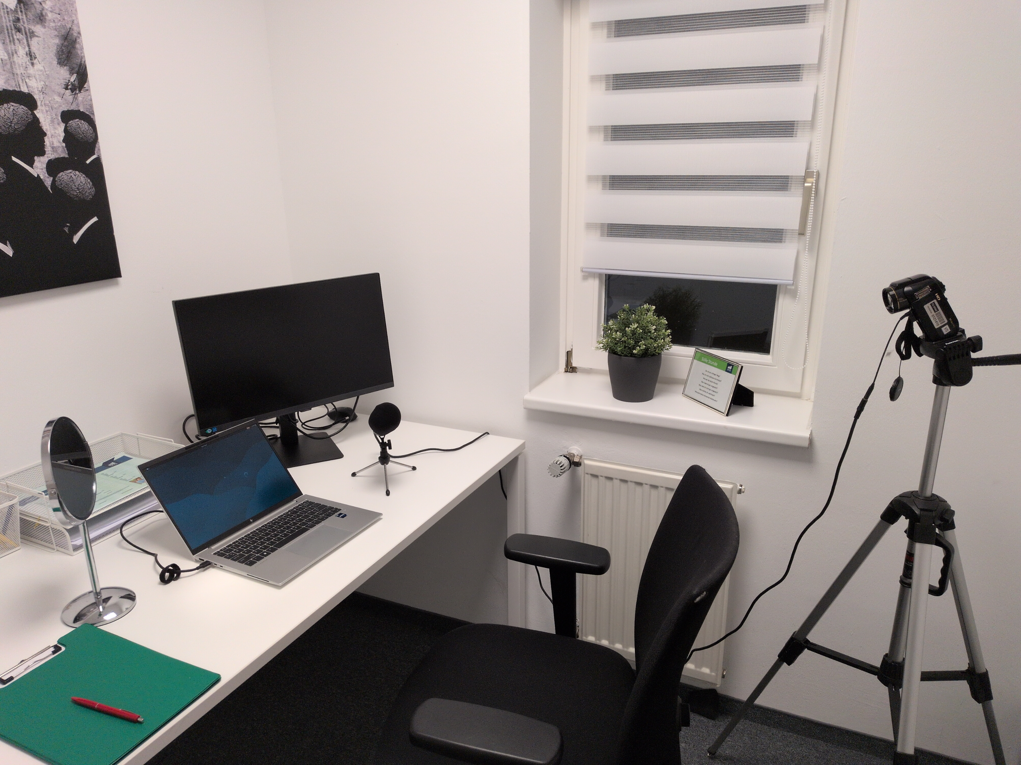
The test room is shown in Figure 1. The environment used for the thinking aloud tests is shown in Table 2. Test users worked on a laptop with its integrated touchpad, no mouse was provided.
| Device | HP Elitebook 840 G10, 32gb RAM |
|---|---|
| OS and Version | Debian 13 |
| Screen Size | 14″ TFT |
| Screen Resolution | 1920×1200 |
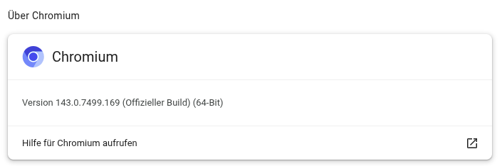
| Web Browser and Version | Chromium 143.0.7499.169 |
| Internet Connection | A1 LTE 4G Hotspot |
| Download Speed | 100 mbps |
| Screen Recording Software | OBS Studio 32.0.4 |
| Recording Resolution | 1920×1080 |
| Video Editing Software | Kdenlive 24.12.3 |
| Video Transcoding Software | Kdenlive 24.12.3 |
The exact web browser version used for the tests is shown in Figure 2. During the tests, no adblocker was used and cookie selection was left to the user. This was only relevant for the training, because the web application does not store any cookies.
To record the external videos, a Sanyo Xacti HD1010 camcorder was mounted on a tripod and connected to a DeLOCK 66640 Stereo Table Microphone. In order to see the facial expressions of the test user in the external video recordings, a mirror was placed to the left of the laptop screen and the camera was positioned to record over the user's right shoulder.
For the session capture video, the integrated webcam and microphone of the laptop were used to overlay the user's face in the bottom left corner of the video.
3.5 Training
To practise thinking aloud, the user was first asked to navigate to
YouTube (youtube.com)
and search for a video of dog food. After finding a video, the user
was asked to navigate to Youtube Music
(music.youtube.com)
and search for a German Rap song, all the time while talking aloud.
3.6 Tasks
The internal task list used by the project team is shown in Table 3.
| Task No. | Description | Short Title | Prerequisites | Completion Criteria | Max. Time | Possible Solution Path |
|---|---|---|---|---|---|---|
| 1 |
Please work your way through the tutorial about Parallel Coordinates. |
Work Through Tutorial |
Browser is open at
|
The user indicates that they have finished the tutorial. |
25 minutes. | |
| 2 | Go to Section 7 Case Study: Student Marks. In the final step (Step 6), enable interactivity, so you can explore the dataset. Do some analysis to check whether there may be a correlation between student marks in Maths and IT. | Simple Correlation | The user indicates that there is a correlation. | 10 minutes. | Section 7 → 6. Explore the Data → Enable Interactivity → Move IT next to Maths → reverse IT | |
| 3 | Go to Section 2 Personal Finances Dataset. Add some extra data to the dataset using the table and see how that affects the chart. | Add Extra Data | 10 minutes. | Section 2 → Add a row → Add a column → Add some data that is not 0 | ||
| 4 | Go to Section 2 Personal Finances Dataset. Let the range of the Income and Cost Column start at 0. | Set Range | The user set the range starting points of Income and Cost to 0. | 10 minutes. | Section 2 → Right click on the cost dimension → Set range → Set Min: 0 → Save → Right click on the income dimension → Set range → Set Min: 0 → Save | |
| 5 | Go to Section 2 Personal Finances Dataset. Download an image of the chart. | Download Image | The user downloaded an image of the chart. | 10 minutes. | Section 2 → Double arrow menu → Download Chart (SVG) → Download | |
| 6 | Go to Section 5 Heart Health Dataset. Download the table as a CSV file to work with it in Excel. | Download CSV | The user downloaded the data as a CSV file. | 10 minutes. | Section 5 → Double arrow menu → Show table → Save as CSV |
3.7 Interview Questions
Each user was interviewed immediately after the final task using the interview script given in Section A.6. Summaries of the interviews can be found in Section 4.6.
3.8 Feedback Questionnaire
After the interview, the user was asked to fill out the feedback questionnaire given in Section A.7. The feedback questionnaire was given on paper. An overview of the results can be seen in Section 4.7.
3.9 Data Collection
Before starting the tests, the test users were given a short introduction. Then, they were given a consent form to read and sign, which can be found in Section A.3. For the background questionnaire, found in Section A.4, the facilitator asked the questions of the user and filled out the form, rather than handing the form to the user to fill out. Any questions regarding data collection were answered before the start of the recording. Once all tasks were finished, the test user was handed a feedback questionnaire to fill out, which can be found in Section A.7.
All video clips contained in this report have pixellated faces to protect the privacy of the test users. The pixellation was performed with Kdenlive. All test users and their data are identified with a first name alias or a unique test person id.
The mapping of user aliases, the signed consent forms, and the full session videos contain personally identifiable data of the test users. These files are not part of this report, are kept separate, and will be deleted within one year.
4 Results
The results of the TA test comprise task completion statistics, positive and negative findings, summaries of interviews with the test users, and an overview of the ratings given by users in the feedback questionnaire. Due to a technical error, all video clips for TP1 were extracted from the external video rather than the session capture video.
4.1 Task Completion
A summary of which users completed each task and whether any assistance was given is shown in Table 5.
| Task 1 | Task 2 | Task 3 | Task 4 | Task 5 | Task 6 | |
|---|---|---|---|---|---|---|
| TP1 | 1* | 1 | 0 | 1 | 1 | 1 |
| TP2 | 1 | 1 | 1 | 1 | 1 | 1 |
| TP3 | 1 | 1 | 1 | 0 | 0 | 1 |
| TP4 | 1 | 1 | 1 | 0 | 1 | 1 |
| TP5 | 1 | 1 | 1 | 1 | 1 | 1 |
| Total | 5 | 5 | 4 | 3 | 4 | 5 |
| % | 100 | 100 | 80 | 60 | 80 | 100 |
4.2 Top Three Positive Findings
The three most positive findings according to their average (mean) positivity ratings are described in more detail below. The positivity rating scheme used to rank positive findings is shown in Table 6.
| Positivity | Meaning |
|---|---|
| 4 | Extremely Positive |
| 3 | Major Positive |
| 2 | Minor Positive |
| 1 | Cosmetic Positive |
| 0 | Not a Positive |
P01. Values Shown when Hovering
| Title: | Values Shown when Hovering |
|---|---|
| Description: | When hovering over a polyline in any chart, the corresponding values on all dimensions are displayed. |
| Video Clip(s): | p01-tp3-hovering-values.mp4, p01-tp4-hovering-values.mp4 |
| Timestamp(s): | TP3 00:10:58, TP4 00:10:35 |
| Location (How Reproducible?): | Go to any chart → Hover over a polyline |
| Mean Positivity: | 3.67 |
The chart was praised for the functionality to see all corresponding values when hovering over a polyline as can be seen in Figure 3.
P02. Mouse Cursor Changes to Indicate Actions
| Title: | Mouse Cursor Changes to Indicate Actions |
|---|---|
| Description: | When hovering over a draggable or clickable object, the mouse cursor changes to indicate the possible action. |
| Video Clip(s): | p02-tp2-cursor-change.mp4 |
| Timestamp(s): | TP2 00:08:38 |
| Location (How Reproducible?): | Go to any chart → Hover over the label of a dimension |
| Mean Positivity: | 3.00 |
The chart actions were praised for the change of the mouse cursor when an object is clickable or draggable as can be seen in Figure 4.
P03. Tab Can Be Used to Advance in Table
| Title: | Tab Can Be Used to Advance in Table |
|---|---|
| Description: | In Section 2, when entering a new value in the same row, the Tab key can be pressed to jump to the next field. |
| Video Clip(s): | p03-tp2-tab-to-advance.mp4 |
| Timestamp(s): | TP2 00:20:43 |
| Location (How Reproducible?): | Section 2 → click a field not in last column → press Tab |
| Mean Positivity: | 1.30 |
The table in Section 2 was praised for the option to jump to the next column when pressing the Tab key. as can be seen in Figure 5.
4.3 List of All Positive Findings
Table 7 shows a list of all the positive aspects observed in the test, sorted in descreasing order of average (mean) positivity, i.e. the most positive are at the top of the table. Positivity ratings were assigned by members of the project team, their name codes are shown in Table 8.
| No. | Title | Description | Video Clip(s) | Timestamp(s) | Location (how reproducible?) | Positivity | |||
|---|---|---|---|---|---|---|---|---|---|
| KA | RG | FZ | Mean | ||||||
| 1 | Values Shown when Hovering | When hovering over a polyline in any chart, the corresponding values on all dimensions are displayed. |
p01-tp3-hovering-values.mp4,
p01-tp4-hovering-values.mp4 |
TP3 00:10:58,
TP4 00:10:35 |
Go to any chart → Hover over a polyline | 4 | 3 | 4 | 3.67 |
| 2 | Mouse Cursor Changes to Indicate Actions | When hovering over a draggable or clickable object, the mouse cursor changes to indicate the possible action. | p02-tp2-cursor-change.mp4 | TP2 00:08:38 | Go to any chart → Hover over the label of a dimension | 3 | 3 | 3 | 3.00 |
| 3 | Tab Can Be Used to Advance in Table | In Section 2, when entering a new value in the same row, the Tab key can be pressed to jump to the next field. | p03-tp2-tab-to-advance.mp4 | TP2 00:20:43 | Section 2 → click a field not in last column → press Tab | 2 | 1 | 1 | 1.30 |
| Code | Meaning |
|---|---|
| KA | Keith Andrews |
| RG | Romana Gruber |
| FZ | Florian Zollner |
4.4 Top Five Problems
The five most serious problems according to their average (mean) severity ratings are described in more detail below. Problem number 1 is the problem (negative finding) with the highest mean severity. The severity rating scheme used to rank problems is shown in Table 9.
| Severity | Meaning |
|---|---|
| 4 | Catastrophic problem |
| 3 | Serious problem |
| 2 | Minor problem |
| 1 | Cosmetic problem |
| 0 | Not a problem |
N01. Inserting 0 into Table Not Possible
| Title: | Inserting 0 into Table Not Possible |
|---|---|
| Description: | In Section 2, it is not possible to redraw the chart after the value 0 is entered into the table, because the “Redraw Chart” button is greyed out. |
| Video Clip(s): | n01-tp1-insert-0.mp4 , n01-tp3-insert-0.mp4, n01-tp4-insert-0.mp4 |
| Timestamp(s): | TP1 00:17:28, TP3 00:07:44, TP4 00:26:04 |
| Location (How Reproducible?): | Section 2 → Table → Change any value to 0 → Redraw chart |
| Mean Severity: | 3.00 |
Three test users discovered that the value 0 cannot be inserted into the chart by typing it into the table in Section 2, because the Redraw chart button becomes disabled, as can be seen in Figure 6.
N02. Zooming into Chart is Not Possible
| Title: | Zooming into Chart is Not Possible |
|---|---|
| Description: | In Section 7, it can be difficult to trace a single polyline or value. The ability to zoom in would be helpful. |
| Video Clip(s): | n02-tp3-chart-zoom.mp4, n02-tp4-chart-zoom.mp4 |
| Timestamp(s): | TP3 00:32:07, TP4 00:21:20 |
| Location (How Reproducible?): | Section 7 → Follow a polyline in a cluster through the chart |
| Mean Severity: | 3.0 |
Selecting a single polyline, especially on a smaller screen, becomes more difficult as the number of polylines increases, as can be seen in Figure 7. This can be solved by introducing a zoom function.
N03. Context Menu Poorly Described
| Title: | Context Menu Poorly Described |
|---|---|
| Description: | The context menu is referenced in Sections 3 and 4, but it is not described how to open the context menu. |
| Video Clip(s): | n03-tp2-context-menu.mp4, n03-tp3-context-menu.mp4, n03-tp4-context-menu.mp4, n03-tp5-context-menu.mp4 |
| Timestamp(s): | TP2 00:09:24, TP3 00:13:14, TP4 00:13:03, TP5 00:10:46 |
| Location (How Reproducible?): | |
| Mean Severity: | 2.67 |
Figuring out what and where the context menu is can be hard for a new user, as can be seen in Figure 8. This can be solved by adding an explanation.
N04. Polyline Selection Difficult
| Title: | Polyline Selection Difficult |
|---|---|
| Description: | Selecting a polyline in any chart is only possible when directly hovering/clicking on the line, which can be difficult depending on the size of the chart and the number of polylines visible. |
| Video Clip(s): | n04-tp1-polyline-selection.mp4, n04-tp2-polyline-selection.mp4, n04-tp4-polyline-selection.mp4, n04-tp5-polyline-selection.mp4 |
| Timestamp(s): | TP1 00:05:41, TP2 00:07:37, TP4 00:09:35, TP5 00:09:59 |
| Location (How Reproducible?): | Go to any chart → Select one or more polylines |
| Mean Severity: | 2.33 |
Selecting one or more polylines can be hard as the area that is clickable is very small, as can be seen in Figure 9. This could be solved by increasing the size a polyline's hit surface.
N05. Case Study Interactivity Poorly Described
| Title: | Case Study Interactivity Poorly Described |
|---|---|
| Description: | In Section 7, it is not explained how the user should interact with the case study and that interactive operations are disabled until Step 6. |
| Video Clip(s): | n05-tp2-case-study-interaction.mp4 n05-tp4-case-study-interaction.mp4 n05-tp5-case-study-interaction.mp4 |
| Timestamp(s): | TP2 00:24:44, TP4 00:20:40, TP5 00:20:44 |
| Location (How Reproducible?): | Section 7 → First paragraph → Only dataset is explained |
| Mean Severity: | 2.33 |
The user is not informed what actions they should do during the case study, as can be seen in Figure 10. This could be solved by adding a short how-to part in the case study or nudging the user with well-known icons and smaller info texts.
4.5 List of All Problems Found
Table 10 shows a list of all the problems observed in the test, sorted in descreasing order of average (mean) severity, i.e. the most severe are at the top of the table. Severity ratings were assigned by members of the project team, their name codes are shown in Table 11.
| No. | Title | Description | Video Clip(s) | Timestamp(s) | Location (how reproducible?) | Severity | |||
|---|---|---|---|---|---|---|---|---|---|
| KA | RG | FZ | Mean | ||||||
| 1 | Inserting 0 into Table Not Possible | In Section 2, it is not possible to redraw the chart after the value 0 is entered into the table, because the “Redraw Chart” button is greyed out. | n01-tp1-insert-0.mp4,
n01-tp3-insert-0.mp4, n01-tp4-insert-0.mp4 |
TP1 00:17:28,
TP3 00:07:44, TP4 00:26:04 |
Section 2 → Table → Change any value to 0 → redraw chart | 2 | 3 | 4 | 3.00 |
| 2 | Zooming into Chart is Not Possible | In Section 7, it can be difficult to trace a single polyline or value. The ability to zoom in would be helpful. | n02-tp3-chart-zoom.mp4,
n02-tp4-chart-zoom.mp4 |
TP3 00:32:07,
TP4 00:21:20 |
Section 7 → Follow a polyline in a cluster through the chart | 4 | 2 | 3 | 3.00 |
| 3 | Context Menu Poorly Described | The context menu is referenced in Sections 3 and 4, but it is nowhere described how to open the context menu. | n03-tp2-context-menu.mp4,
n03-tp3-context-menu.mp4, n03-tp4-context-menu.mp4, n03-tp5-context-menu.mp4 |
TP2 00:09:24,
TP3 00:13:14, TP4 00:13:03, TP5 00:10:46 |
3 | 2 | 3 | 2.67 | |
| 4 | Polyline Selection Difficult | Selecting a polyline in any chart is only possible when directly hovering/clicking on the line, which can be difficult depending on the size of the chart and the number of polylines visible. | n04-tp1-polyline-selection.mp4,
n04-tp2-polyline-selection.mp4, n04-tp4-polyline-selection.mp4, n04-tp5-polyline-selection.mp4 |
TP1 00:05:41,
TP2 00:07:37, TP4 00:09:35, TP5 00:09:59 |
Go to any chart → Select one or more polylines | 3 | 1 | 3 | 2.33 |
| 5 | Case Study Interactivity Poorly Described | In Section 7, it is not explained how the user should interact with the case study and that interactive operations are disabled until Step 6. | n05-tp2-case-study-interaction.mp4,
n05-tp4-case-study-interaction.mp4, n05-tp5-case-study-interaction.mp4 |
TP2 00:24:44,
TP4 00:20:40, TP5 00:20:44 |
Section 7 → First paragraph → Only dataset is explained | 2 | 2 | 3 | 2.33 |
| 6 | Filtering Icon Poorly Described | In Section 3, under “Filtering Records” it is verbally explained how to filter, but a graphic representation of the “double edged range sliders” is missing and can be misinterpreted. | n06-tp1-filtering-icon.mp4,
n06-tp3-filtering-icon.mp4, n06-tp4-filtering-icon.mp4 |
TP1 00:04:56,
TP3 00:09:17, TP4 00:07:52 |
Section 3 → Filtering Records | 3 | 2 | 2 | 2.33 |
| 7 | Transition of Charts Not In Sync With Text | In Section 4, when scrolling down in the text, it can happen that the user is still reading text, while the chart has already switched to the “Heart Health” dataset. | n07-tp3-chart-transition.mp4 | TP3 00:34:35 | Section 4 → scroll down until Section 5 is in the middle of the page | 3 | 1 | 1 | 1.67 |
| 8 | Touchpad Too Sensitive | The sensitivity of the touchpad was too high. | n08-tp2-sensitive-touchpad.mp4,
n08-tp3-sensitive-touchpad.mp4, n08-tp4-sensitive-touchpad.mp4, n08-tp5-sensitive-touchpad.mp4 |
TP2 00:03:51,
TP3 00:04:41, TP4 00:07:27, TP5 00:12:16 |
Open Web Application → scroll down | 2 | 0 | 2 | 1.33 |
| 9 | Toolbar Button Tooltips are Not Shown When Quickly Skimming Over | The meaning of the chart toolbar buttons is unclear. When quickly skimming over the buttons, the tooltips are not shown. | n09-tp4-button-tooltipps.mp4 | TP4 00:26:31 | Any Chart → Click the double arrow toolbar | 1 | 1 | 2 | 1.33 |
| 10 | Case Study Enable Interactivity Feedback Missing | In Section 7, Step 7, there is no clear feedback from the application if interactivity is enabled or not. | n10-tp3-case-study-feedback.mp4 | TP3 00:23:23 | Section 7 → Step 6 → Enable Interactivity | 2 | 0 | 2 | 1.33 |
| 11 | Download CSV Button Not Available in Chart Toolbar | In order to download a CSV file of the dataset, the user needs to view the data table. The Download CSV button should possibly be made available in the Toolbar. | n11-tp2-download-csv.mp4 | TP2 00:21:37 | Go to any chart → Toolbar → Table | 2 | 0 | 1 | 1.00 |
| Code | Meaning |
|---|---|
| KA | Keith Andrews |
| RG | Romana Gruber |
| FZ | Florian Zollner |
4.6 Interviews
TP1 “Peter” immediately mentioned that he would have expected a filter icon and not an entry in the context menu. He love the interactivity and wanted to directly access the chart in Section 7 without going to the last step. He understood what parallel coordinates are, but wondered about the meaning behind the name.
TP2 “Bob” pointed out that the “position” of the context menu is not intuitive, that he was confused at first that the chart in Section 7 only enabled interactivity in the last Step and that it is difficult to “catch” a polyline. He liked the fact that he learned a new skill and mentioned that he might use parallel coordinates in his professional life.
TP3 “Julian” mentioned that the tool was interesting and the interactivity was nice. He now knows what parallel coordinates are and liked the “playful” experience. He found the data of the heart health dataset interesting, but was overwhelmed with the amount of data in the chart of Section 7. He was unhappy that 0 could not be entered in the first table.
TP4 “James” found it hard to distinguish individual polylines and was frustrated that he could not find the context menu. He found the parallel coordinates interesting and understands them better. He noted that the technique is not optimal for huge amounts of data. For the chart actions, he would have liked a separate menu for controlling actions like reversing. It was a pleasant experience for him, but he was irritated with the scrolling speed being to fast.
TP5 “Robert” found the experience fun, straightforward, and most of it well explained. He can use parallel coordinates now and liked the learning process. He does not like to work with a touchpad and found it hard to select polylines.
4.7 Feedback Questionnaires
Table 12 shows a summary of the ratings given by users in the feedback questionnaire at the end of the test. The neutral scale in the original feedback questionnaire has been mapped to a weighted scale between 6 (best) and 0 (worst). The numbers in bold indicate the (rounded) mean rating. The original blank questionnaire can be found in Section A.7. Scans of the questionnaires as completed by each test user can be found in Section B.2.
| TP1 | TP2 | TP3 | TP4 | TP5 | Mean | Std Dev | |||||
|---|---|---|---|---|---|---|---|---|---|---|---|
| 1. | Getting to the right part of the site. | Very easy | 6 5 4 3 2 1 0 | Very hard | 6 | 5 | 5 | 5 | 5 | 5.20 | 0.45 |
| 2. | Quality of information. | Very good | 6 5 4 3 2 1 0 | Very poor | 5 | 6 | 5 | 5 | 6 | 5.40 | 0.55 |
| 3. | It is easy to read the text. | Very easy | 6 5 4 3 2 1 0 | Very hard | 4 | 1 | 3 | 6 | 6 | 4.00 | 2.12 |
| 4. | Appearance of site, including colours and graphics. | Very good | 6 5 4 3 2 1 0 | Very poor | 5 | 4 | 2 | 1 | 5 | 3.40 | 1.82 |
| 5. | Consistency of site. | Very consistent | 6 5 4 3 2 1 0 | Very inconsistent | 3 | 6 | 6 | 5 | 6 | 5.20 | 1.30 |
| 6. | Speed of pages displaying. | Very fast | 6 5 4 3 2 1 0 | Very slow | 6 | 6 | 6 | 3 | 6 | 5.40 | 1.34 |
| 7. | Overall impression of the web site. | Very good | 6 5 4 3 2 1 0 | Very bad | 5 | 5 | 3 | 3 | 6 | 4.40 | 1.34 |
| 8. | Do you consider this site to be trustworthy? | Definitely | 6 5 4 3 2 1 0 | Not at all | 6 | 6 | 5 | 4 | 6 | 5.40 | 0.89 |
| 9. | How likely are you to return to this site later? | Definitely | 6 5 4 3 2 1 0 | Never | 4 | 4 | 0 | 1 | 0 | 1.80 | 2.05 |
| 10. | Would you recommend this site to a friend or colleague? | Definitely | 6 5 4 3 2 1 0 | Never | 4 | 5 | 5 | 4 | 6 | 4.80 | 0.84 |
| 11. | Do you understand parallel coordinates after going through the explainer? | Very much | 6 5 4 3 2 1 0 | Not at all | 5 | 6 | 6 | 5 | 6 | 5.60 | 0.55 |
| 12. | Was it a pleasant experience going through the tutorial? | Definitely | 6 5 4 3 2 1 0 | Not at all | 6 | 5 | 5 | 5 | 6 | 5.40 | 0.55 |
As can be seen in the ratings for Questions 11 and 12, the test users enjoyed working through the PCEE tutorial, and successfully gained an understanding of the parallel coordinates technique. They also assessed the quality of the information in the tutorial to be quite high.
References
- [And2025a]
-
Keith Andrews;
Parallel Coordinates Explorable Explainer (PCEE);
visited 07 Dec 2025
https://github.com/tugraz-isds/pcee - [And2025b]
-
Keith Andrews;
Parallel Coordinates: An Explorable Explainer;
visited 07 Dec 2025
https://tugraz-isds.github.io/pcee/ - [Bar2020]
- Carol M. Barnum; Usability Testing Essentials; 2nd Edition, Morgan Kaufmann, 2020. ISBN 0128169427.
- [Nie2012]
- Jakob Nielsen;
Thinking Aloud: The #1 Usability Tool;
15 Jan 2012.
https://nngroup.com/articles/thinking-aloud-the-1-usability-tool/ - [Als2015]
- Thamer Alshammari, Obead Alhadreti, and Pam J. Mayhew;
When to Ask Participants to Think Aloud:
A Comparative Study of Concurrent and
Retrospective Think-Aloud Methods;
International Journal of Human Computer Interaction, 31 Jul 2015.
https://cscjournals.org/library/manuscriptinfo.php?mc=IJHCI-118
A Project Team Materials
A.1 Checklist
The following checklist was used for the tests:
checklist.html.
A.2 Orientation Script
The following orientation script was used for the tests:
orient.html.
A.3 Consent Form
The following blank consent form was used in the tests:
consent-ta.pdf.
A.4 Background Questionnaire
The following blank background questionnaire was used in the tests:
background.html.
A.5 Task Slips
The following task slips were presented to the test users:
external-tasks-ta.pdf.
A.6 Interview Script
The following interview script was used in the tests:
interview.html.
A.7 Feedback Questionnaire
The following blank feedback questionnaire was used in the tests:
feedback.html.
B User Materials
The following materials were filled out for each test user.
B.1 Completed Background Questionnaires
For each test user, the completed background questionnaire was scanned as PDF:
B.2 Completed Feedback Questionnaires
For each test user, the completed feedback questionnaire was scanned as PDF:
C Protected Materials
The following materials contain contain identifiable personal data of the test users. They are managed separately and are not part of this report.
C.1 User Aliases
The mapping of test users' aliases to their real names is documented
in the file users.html.
C.2 Signed Consent Forms
For each test user, the signed consent form was scanned as PDF:
tp1-consent.pdftp2-consent.pdftp3-consent.pdftp4-consent.pdftp5-consent.pdf
C.3 External Videos
For each test user, the entire test was captured with a tripod-mounted external video camera in the following files:
- TP1 “Peter”:
tp1-ext.mp4 - TP2 “Bob”:
tp2-ext.mp4 - TP3 “Julian”:
tp3-ext.mp4 - TP4 “James”:
tp4-ext.mp4 - TP5 “Robert”:
tp5-ext.mp4
C.4 Session Capture Videos
For each test user, the entire test session on the computer was captured in the following files:
- TP1 “Peter”:
tp1.mp4 - TP2 “Bob”:
tp2.mp4 - TP3 “Julian”:
tp3.mp4 - TP4 “James”:
tp4.mp4 - TP5 “Robert”:
tp5.mp4