Prof. Keith Andrews
ISDS, Graz University of Technology, Austria
http://isds.tugraz.at/keith/
Slides:
http://keithandrews.com/talks/2018/wuc-2018-10-17-infovis/
Course Notes:
http://courses.isds.tugraz.at/ivis/ivis.pdf
Wed 17 Oct 2018, World Usability Congress, Graz, Austria.
| Month | Salesperson A | Salesperson B |
|---|---|---|
| 2012-01 | 28,366 | 23,274 |
| 2012-02 | 27,050 | 21,732 |
| 2012-03 | 29,463 | 23,845 |
| 2012-04 | 32,561 | 28,732 |
| 2012-05 | 28,050 | 24,023 |
| 2012-06 | 30,100 | 26,089 |
| 2012-07 | 22,343 | 19,026 |
| 2012-08 | 21,506 | 17,903 |
| 2012-09 | 24,664 | 19,387 |
| 2012-10 | 28,842 | 23,490 |
| 2012-11 | 30,621 | 25,873 |
| 2012-12 | 36,254 | 28,490 |
“Let my dataset change your mindset.”
[Hans Rosling, title of talk at TED@State, 03 Jun 2009]
Information visualisation (InfoVis) is the visual presentation of abstract information spaces and structures, together with accompanying interactions, so as to facilitate their rapid assimilation and understanding.
The broader field of visualisation has three main sub-fields:
Information Visualisation (InfoVis) deals with abstract information structures, such as hierarchies, networks, or multidimensional spaces.
Geographic Visualisation (GeoVis) is map-based. The data typically has inherent 2d or 3d spatial coordinates, and is generally shown in relation to a map.
Scientific Visualisation (SciVis) typically involves concrete (3d) objects, for example a medical scan of part of the body, or a simulation of air flow around an aircraft wing. SciVis visualisations often depict flows, volumes, and surfaces in (3d) space.
Data Visualisation (DataVis) = InfoVis + GeoVis.
Visual Analytics = DataVis (frontend) + Analytics (backend).
InfoVis ≠ SciVis or GeoVis:
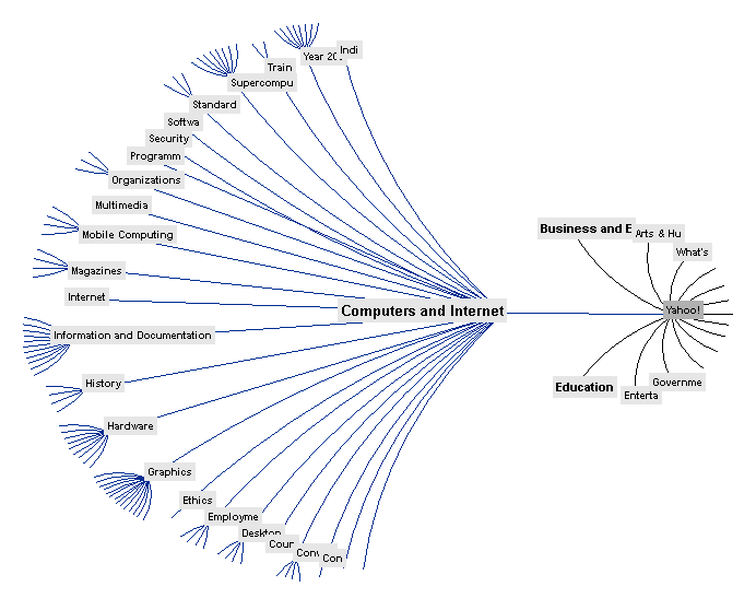
doi:10.1145/192426.192430
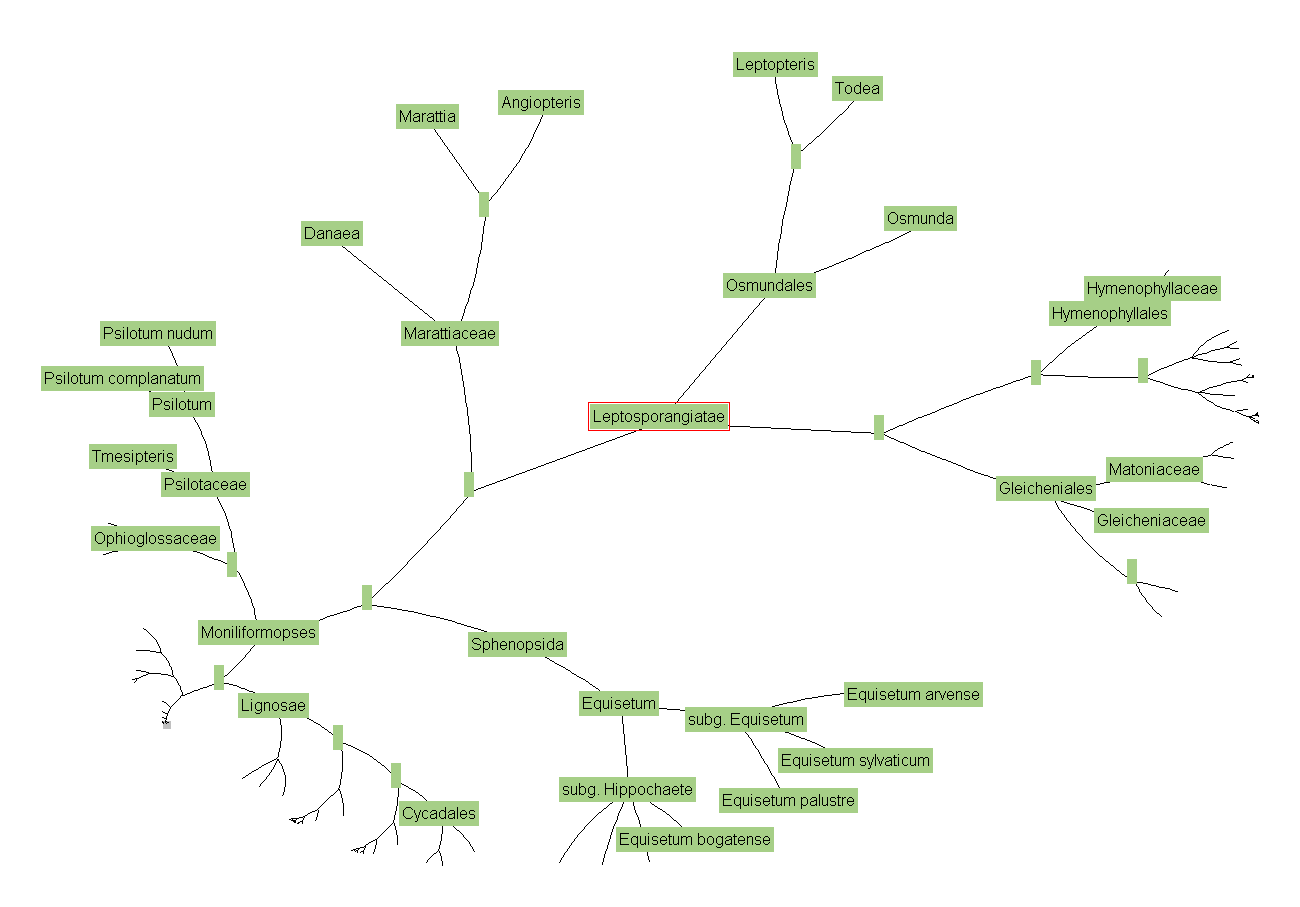
http://ucjeps.berkeley.edu/htree_intro.html
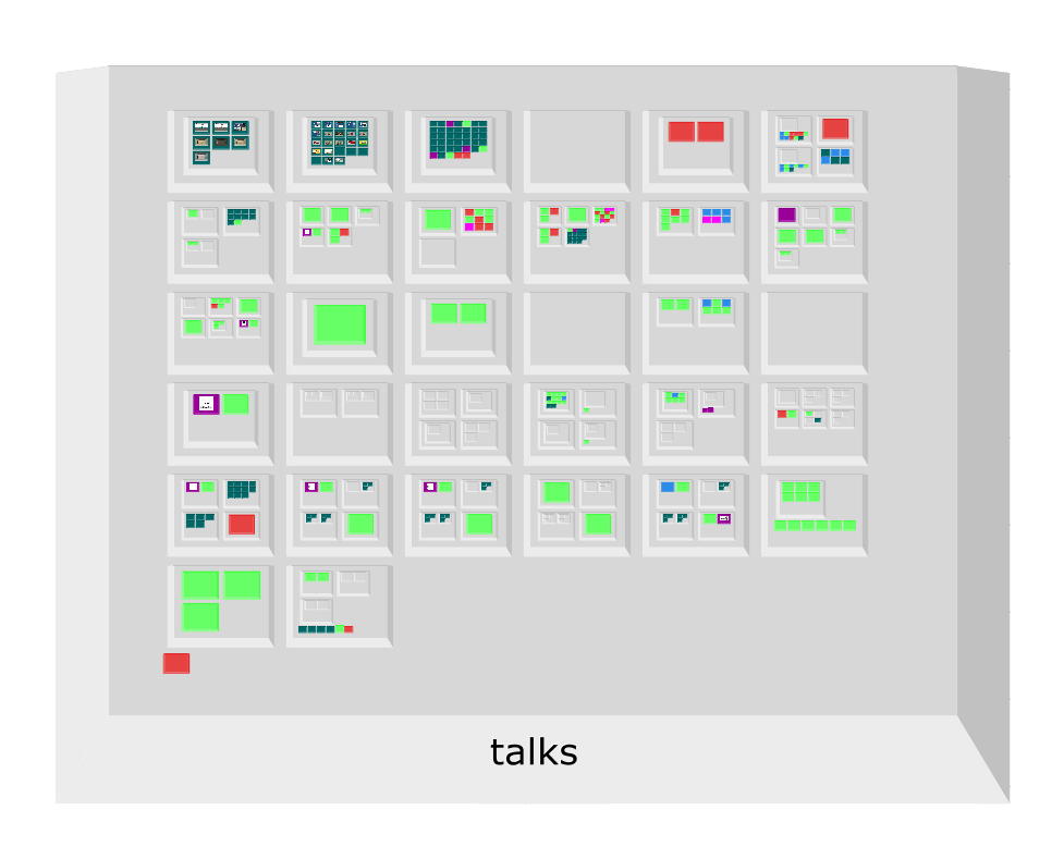
doi:10.1109/IV.2002.1028871
| City | Net Purchasing Power | Prices (incl. rent) | Net Wages | Working Time [hours per year] | Vacation [paid working days per year] | Time Required for Big Mac [minutes] | Time Required for iPhone 4S 16gb [hours] | City Break | Inflation 2011 |
|---|---|---|---|---|---|---|---|---|---|
| Amsterdam | 90.1 | 69.1 | 69.4 | 1755 | 24 | 15 | 44 | 720 | 2.48 |
| Athens | 60.5 | 58.2 | 40.0 | 1822 | 22 | 29 | 86 | 590 | 3.10 |
| Auckland | 82.9 | 67.8 | 63.5 | 1852 | 20 | 15 | 51 | 580 | 4.03 |
| Bangkok | 31.4 | 48.2 | 17.4 | 2312 | 7 | 36 | 165 | 550 | 3.81 |
| Barcelona | 78.6 | 65.6 | 58.7 | 1760 | 29 | 18 | 52 | 740 | 3.05 |
| Beijing | 29.9 | 51.8 | 18.0 | 1979 | 9 | 34 | 184 | 730 | 5.42 |
| Berlin | 97.1 | 64.1 | 70.1 | 1742 | 28 | 16 | 56 | 720 | 2.48 |
| Bogotá | 40.7 | 47.0 | 22.0 | 1981 | 15 | 52 | 142 | 540 | 3.42 |
| Bratislava | 50.7 | 47.1 | 27.3 | 1884 | 23 | 31 | 126 | 490 | 4.08 |
| Brussels | 78.5 | 68.8 | 59.5 | 1729 | 20 | 19 | 54 | 730 | 3.47 |
| Budapest | 32.0 | 50.4 | 18.1 | 1912 | 22 | 49 | 206 | 740 | 3.90 |
| Buenos Aires | 46.2 | 47.7 | 25.4 | 1830 | 13 | 45 | 187 | 620 | 9.78 |
| Bucharest | 34.0 | 34.8 | 13.5 | 1836 | 26 | 57 | 230 | 370 | 5.81 |
| Caracas | 25.7 | 85.4 | 23.4 | 1878 | 17 | 80 | 272 | 830 | 26.09 |
| ... |
https://www.ubs.com/microsites/prices-earnings/open-data.html
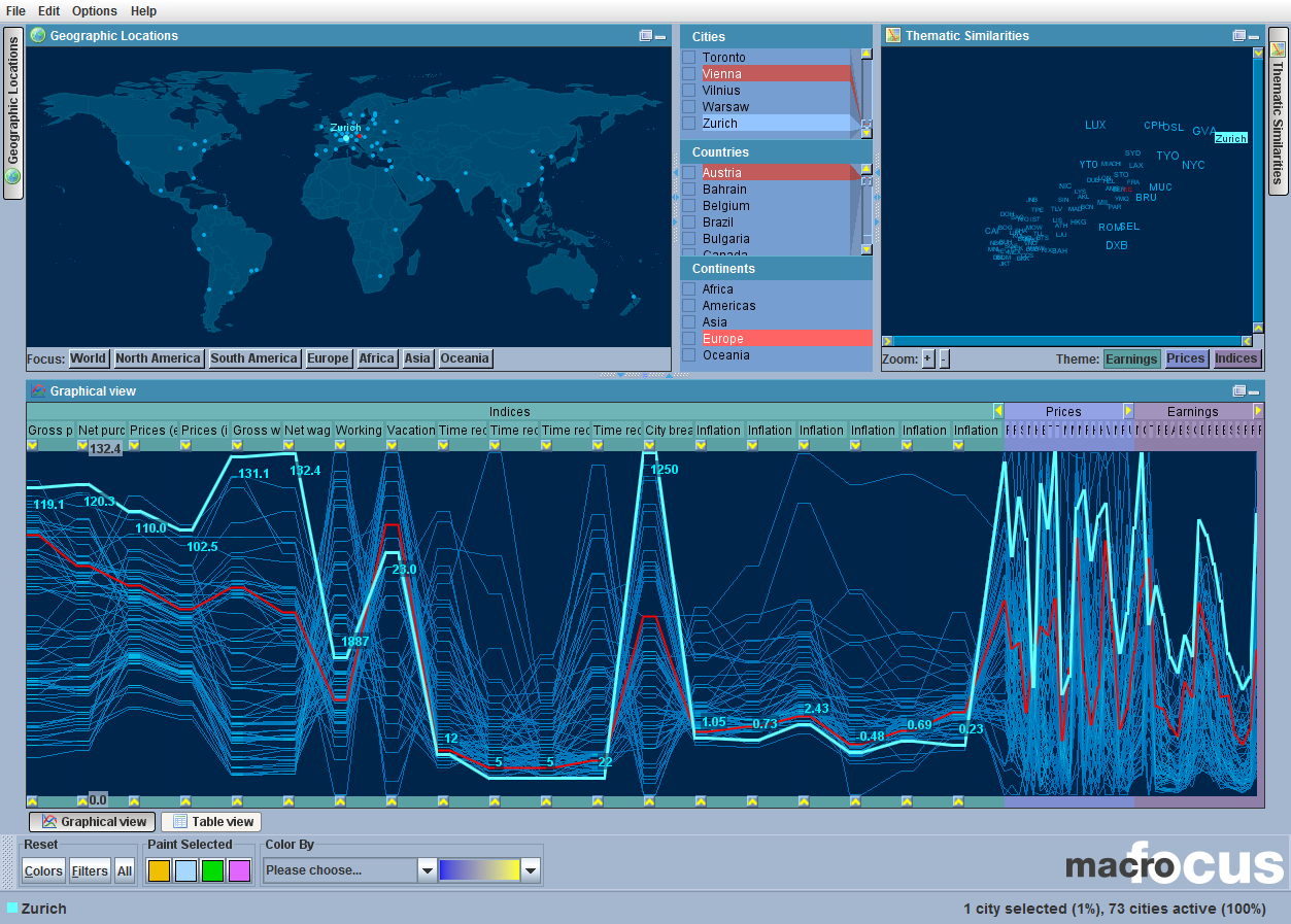
doi:10.1109/CMV.2003.1215008
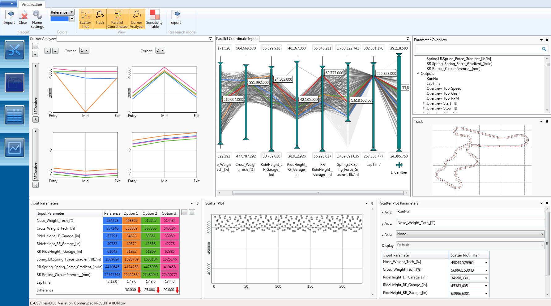
doi:10.1145/2809563.2809588
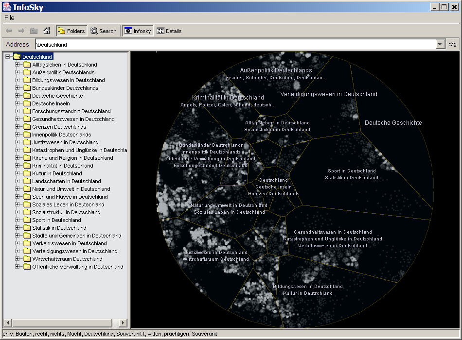
doi:10.1057/palgrave.ivs.9500023
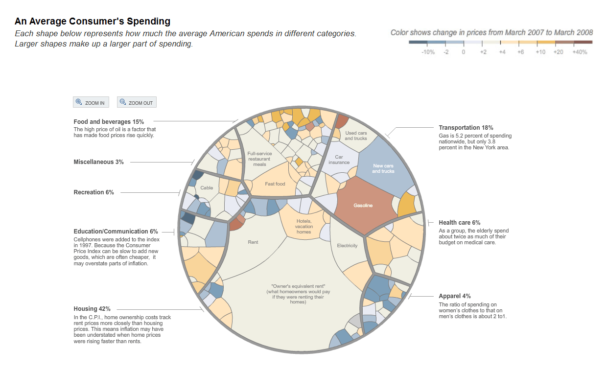
http://nytimes.com/interactive/2008/05/03/business/20080403_SPENDING_GRAPHIC.html
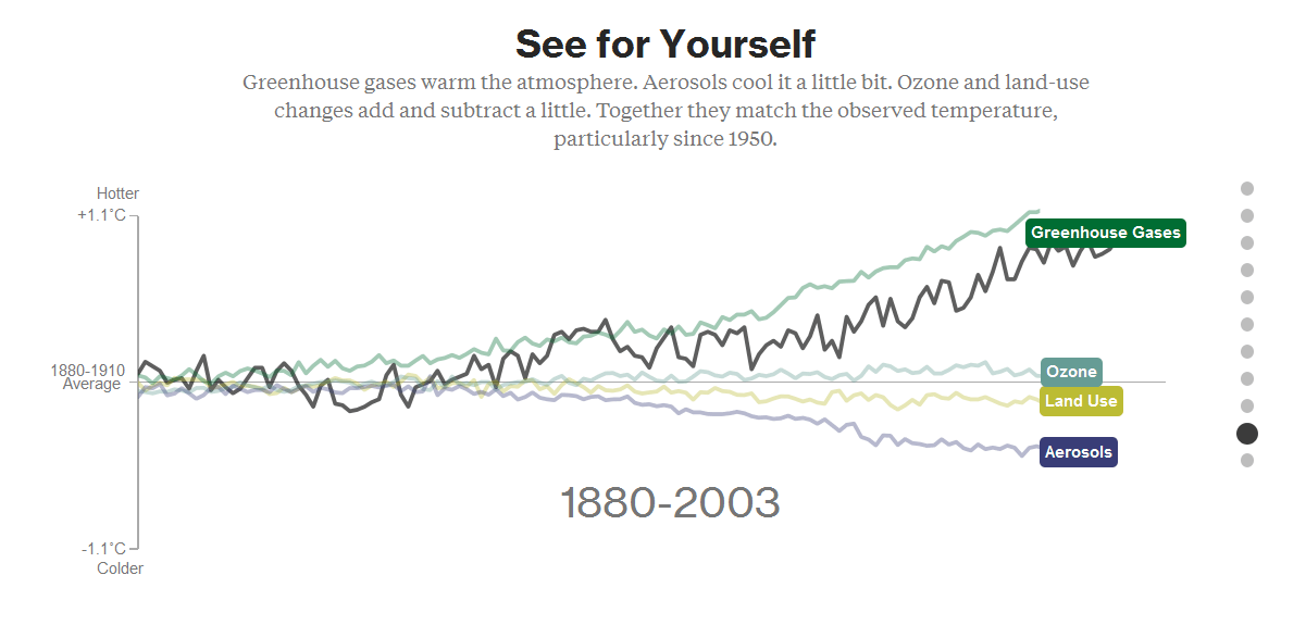
https://bloomberg.com/graphics/2015-whats-warming-the-world/
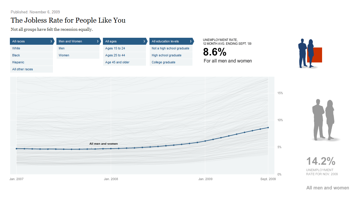
http://nytimes.com/interactive/2009/11/06/business/economy/unemployment-lines.html
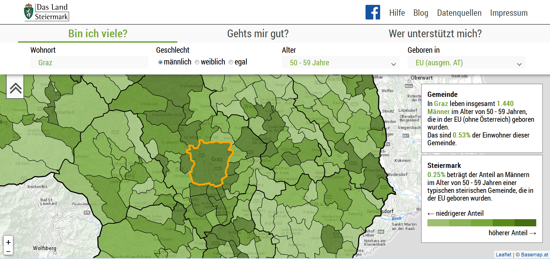
http://diversitaet.steiermark.at/steirische-vielfalt/
openrefine.org
http://vis.stanford.edu/wrangler/
trifacta.com
Four varieties:
tableau.com
qlik.com
spotfire.tibco.com
datawrapper.de
(either hosted or PHP on own server)
many-eyes.comhttp://computerworld.com/article/2930326/
docs.google.com
https://eagereyes.org/criticism/the-rise-and-fall-of-swivel
datamaps.eu
rawgraphs.io
vega.github.io
data-illustrator.com
ggplot2.org
http://cran.r-project.org/web/packages/portfolio/
scipy.org
http://matplotlib.sourceforge.net/
http://home.gna.org/veusz/
http://scidavis.sourceforge.net/
http://orange.biolab.si/
processing.org
prefuse.org
ivtk.sourceforge.net
flare.prefuse.org
http://lab.kapit.fr/default/Kalileo/
http://code.google.com/p/birdeye/
Three ways to draw graphics dynamically using JavaScript:
http://w3.org/TR/2dcontext/
http://sitepoint.com/surviving-the-zombie-apocalypse-manipulating-svg-with-javascript/
webgl.org
raphaeljs.com
threejs.org
https://jonobr1.github.io/two.js/
pixijs.com
d3js.org
https://gionkunz.github.io/chartist-js/
chartjs.org
http://projects.iicm.tugraz.at/fluiddiagrams/
dimplejs.org
c3js.org
http://dc-js.github.io/dc.js/
https://trifacta.github.io/vega/
Scalable Visualisations:
Responsive Visualisations:
https://projects.isds.tugraz.at/respvis/
Demo: Responsive SVG Logo.
See the original discussions at:
http://blog.cloudfour.com/media-queries-in-svg-images/
http://people.opera.com/andreasb/demos/demos_svgopen2009/update/svgscalelogo.html
Demo: Responsive SVG Line Chart.
At narrower widths:
Demo: Responsive Line Chart
At narrower widths:
Demo: Responsive Bar Chart
Demo: Responsive Scatterplot
See also:
http://youtu.be/BrmwjVdaxMM
doi:10.2312/eurovisshort.20141155http://www.cc.gatech.edu/~stasko/papers/avi14-touch.pdfhttp://vimeo.com/97798460
desc element).
http://vrl.cs.brown.edu/color
http://colororacle.org/resources/2007_JennyKelso_ColorDesign_hires.pdf
https://paciellogroup.com/resources/contrastanalyser/
https://sitepoint.com/tips-accessible-svg/
https://youtu.be/Bqhh0ZOSEq8http://ljwatson.github.io/decks/2016/graphicalweb/
https://w3.org/TR/graphics-aria-1.0/
designingwithdata.com
http://ted.com/talks/hans_rosling_shows_the_best_stats_you_ve_ever_seen.html
http://ted.com/talks/david_mccandless_the_beauty_of_data_visualization.html
http://youtu.be/fnyKj8r0CN4
ieeevis.org
ivapp.visigrapp.org
eurovis.org
Thanks to the following students and collaborators for helping to build the responsive demos:
Prof. Keith Andrews
ISDS, Graz University of Technology, Austria
http://isds.tugraz.at/keith/
These slides:
http://keithandrews.com/talks/2018/wuc-2018-10-17-infovis/
Course Notes on Information Visualisation:
http://courses.isds.tugraz.at/ivis/ivis.pdf